Wednesday, December 23, 2020

Taking a look at the most interesting ink in my collection!

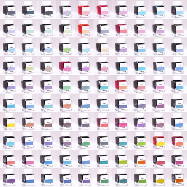
Closer look at Sailor’s Ink Studio line: 

History & Background:

If you have been reading my blogs it comes as no surprise that Sailor makes some of my favorite inks and a lot of them come from this line of their inks. If you aren’t familiar with Sailor, they are the oldest fountain pen manufacturer in Japan and have risen to a global acclaim during this time. As far as their ink studio goes the collection is comprised of 100 inks that are based upon the custom blends that the ink meister Ishimaru mixes for people at pen shows. The numbers don’t seem to be random however Sailor themselves haven’t said anything about the pattern of the numbering system so I believe it is to denote how the ink is mixed and how much of different components go into a single ink. Obviously I can’t take a look at every single ink studio ink however I will be going over the ones found in my own personal collection, those being inks #531, #973, #252, and #280. Without further ado lets take a look at how these inks behave on Tomoe River paper!

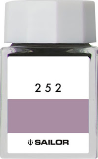
Ink #252:

    This is one of the newest releases from the ink studio line and it was actually one of three that replaced three other inks that Sailor decided to retire for some reason and coincidentally I'll be going over one of those retired ones a little later. This one is very interesting and is actually marketed as behaving differently depending on the paper its used on, I mainly use Tomoe River 52g and it looks pretty purple-gray. The ink does this weird thing that I’ve noticed with sailor and that’s that it gets these sort of pockets of different colors, different from shading. Shading makes it sound like a gradient which is not what this effect looks like so keep in mind that it is going to look a little different. 

Ink #280:

    This is another ink in the set of three that 252 was apart of so it's one of the newest inks and I really didn't know if I'd like this because I didn't have any inks remotely like this color previously but I gotta say, I was not disappointed. It almost reminds me of a muted watermelon color because the base color is a soft tan but has some really interesting green and light pink shading in the lighter spots. This is just an example of how Sailor really elevates colors because when looking at this bottle I don't think I'd buy it just because the color isn't really my thing but when you see the swabs and how it changes on paper and heavy application it really changes and becomes a completely different ink. 

Ink #531:

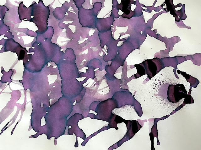
    This is one of the inks from the line that has been retired recently which means that some places may still have the inks available however they won't be produced any longer so what's out there is it for the foreseeable future. Im not really sure why they picked this ink to go, I know that they want to have 100 inks in the line so I suppose they had to get rid of 3 if they wanted to add 3 but I have no idea how they picked the inks to retire. The ink itself is a very vibrant pink that has some darker shading but really not much color variance like the other two on the list, the bottle I used for the splatter is actually my mother's and she really enjoys this ink, both of us are sad to see it go. Not much in the way of sheen but like I said, just take a look at this shading... 

Ink #973:

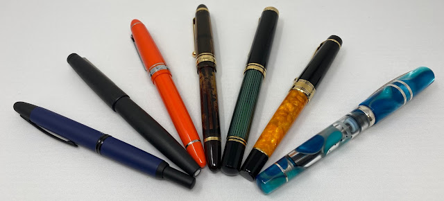
Okay, last but not least we actually have my favorite ink from the studio line and that is #973, I find that my pen choice really gravitates towards gold trim and more brown or earth hue pens so I needed something really interesting to put in them that would not only match the pens but also be fun to look at when it was done drying and spoiler alert, I found all of that in this ink. The ink itself has some very subtle dark sheen but the shading is really what pops with this ink. I like it in any nib size because it can look either orange or brown and is a perfect fall color. It also, so far, has not crusted up at all like some of my other orange inks and is very well behaved despite the problems orange inks are usually plagued with. This is in two of my pens currently and I make sure I have at least one pen inked with it at all times that's how much I like this ink. Oh, and I forgot to mention this was the ink that first got me into the Ink Studio line. 


Wednesday, October 21, 2020

Fountain Pen Day 2020 Handwriting Competition

Fountain Pen Day 2020 Handwriting Competition

Did you grow up in schools with draconian penmanship standards? Did you spend hours getting your cursive just right? Have you ever been complimented on your print? Now is your time to shine. To celebrate Fountain Pen Day on November 6th, Pen Boutique is holding a handwriting competition! If you think you have good handwriting, get out your favorite fountain pen and submit a handwriting sample. We'll have prizes for best cursive, best print, best under 15, and best in show. Submissions are open until November 6th, so enter as soon as possible and show us what you can do! 

Each participant can make one entry for print and one entry for cursive. To enter, send us a handwriting sample with a 50-100 word passage of your choice, and the pen and ink you used. We'll be accepting submissions via DMs, tagged posts on Instagram, and email.

An example submission

The categories are as follows:
Best In Show (Prize: Graf Von Faber-Castell Blue Fountain Pen (worth $350!))
    This is for the best overall submission across the cursive and print categories. Whichever entry stands out the most as exemplary penmanship, either cursive or print, will be our Best In Show winner. The runner up in whichever category the Best In Show winner comes from will be considered the winner for that category.
Best Cursive (Prize: Diplomat Aero Fountain pen (worth $195))
    This category is for the best overall cursive handwriting. We'll be judging entries based on general aesthetic appeal, consistency of forms, and flow between letters. You can use any system of cursive handwriting (Spencerian, Palmer's, etc.).
Best Print (Prize: TWSBI Vac 700  IRIS fountain pen ( new one))
    This category is for the best overall print handwriting. We'll be judging entries based on general aesthetic appeal, consistency of forms, uniqueness, and legibility. 
Best 15 And Under (Prizes: 10 Platinum Prefounte fountain pens) 
    This category will be accepting both print and cursive submissions, and will have 10 winners, each of whom will receive a prize. Entries will be judged based on the criteria for the relevant category described above. When making a submission for the 15 and Under category, be sure to mention that the participant is 15 or younger so we know to consider them for this category.

Good luck and happy Fountain Pen Day!

Friday, October 2, 2020

Coming Soon: Punilabo Pen Cases

                                      Punilabo Pen Cases


Coming in soon are these adorable Punilabo Pen Cases!

There are 10 different animal options available:

Penguin, Parakeet, Boston Terrier, Calico Cat, Panda, Pig, Gray Cat, Black Cat, Shiba Inu Dog, and Brown Bear. 

These are silicone cases that are easy to cary and can easily transform into a pen cup for your desk! 
The bottom of the case pops up when you press it down on a desk, lifting the contents and making them easy to pick through.

They are also water resistant and easy to clean. 

You can use them for almost anything -- pens, pencils, cosmetics, accessories, etc up to 6.5".

We should be getting them in next week, so keep an eye out for them!


Wednesday, September 23, 2020

Ready to take the next step in the fountain pen world?

 So, What's Next?

    So you've already familiarized yourself with the "intro" pens like the Lamy Safari, Twsbi Eco, Kaweco Sport and you may be asking yourself what's next. Don't worry, you are far from done with the world of fountain pens and there are hundreds of undiscovered pens that are waiting be written with. Usually when people see expensive pens the knee jerk reaction is "Why should I spend X amount on a pen?" this is a valid question because a lot of different things can affect a pen's price. Some things that change when going to higher priced pens is the nib, filling system, material, craftsmanship, uniqueness, limited availability, and unfortunately name recognition. In this blog I'm going to show you my progression of pens that I would recommend for people just looking to break into the next price point. Before we get into the actual pens I'm going to explain a little bit about all the main materials and nibs that you commonly see when going up in price so let's get to it!

Nibs: 

    Usually you will see nibs made out of stainless steel on some lower priced pens but the two are not mutually exclusive and some brands will still use steel nibs well into the 250-1000 range although it is not very common. The most common nib on more expensive pens are solid gold and these are usually in 14kt, 18kt, and Sailor even makes a 21kt nib. The benefit of gold over steel is that it tends to be softer and can have a little more flex which allows for some line variation in semi-flex and "full flex" nibs, I put "full flex" in quotes because there really isn't a modern day equivalent to vintage full flex so we can get close with contemporary options but nothing will be a perfect mirror of vintage flex nibs. 
The other thing that comes with gold nibs and can affect price is the feed and nib sizes/grinds. The feed is what supplies the nib with ink and this is commonly made out of plastic but some brands will opt for a material called "ebonite" which is a hardened rubber that is a little more porous than plastic. This is good because it holds a little more ink and does a better job of supplying and keeping the nib inked, preventing hard starts and skipping. As far as grinds and nib types go, gold gives you more options for stuff like elastic nib mods which are basically flex nibs with a lot of line variation, you can also get smooth writing stubs and fun stuff like that. I think I covered most of the nib stuff, now let's get into the material and filling systems!

Materials:

        Materials can also get a bit overwhelming when going up in price, the main ones I can think of off the top of my head are celluloid, Raden inlay, Urushi lacquer, ebonite, special acrylic, custom acrylic, wood, sterling silver/vermeil, and "precious resin". A lot of these come from Japanese pen making and I'll take about them all together very briefly. 
Raden inlay is also referred to as shell inlay and is a very time consuming and tedious process of cutting very thin pieces of shell and then carefully putting it onto the pen either as part of a subject on the pen to give it added depth or just as a collection of raden on the pen. This is usually sealed underneath coats of Urushi lacquer which is a naturally occurring substance almost like a tree sap that, when hardened, is one of the strongest naturally occurring materials. This is also a very time consuming process because there are a couple ways to apply it to pens and each layer needs to dry for anytime between a day to a week per layer. Celluloid and ebonite were common in vintage pens before high quality plastic came along, both materials have the potential for beauty but are less stable than plastic, resin or acrylic so they take some added care and attention to maintain.
 Ebonite is a hardened rubber material that can be made in a variety of beautiful colors and is also used a lot for the bases of Urushi lacquer pens. Raw ebonite is a slightly delicate material because it is susceptible to color change over time through exposure to light or even gases from old filling systems that discolor from the inside out, as long as you store your pens in a dark and humidity controlled place as well as clean them regularly you should have no problem with this discoloration for a good while. 
Celluloid is also a material common in vintage pens and comes in some dazzling finishes, Arco celluloid is commonly cited as one of the most sought after materials in pens however the production process was so dangerous that the rod stock can no longer be manufactured and brands like ASC bought all of the existing rod stock from Omas which means once they are gone that's it. This material is also susceptible to discoloration, warping and disintegration. If you take the same attention that ebonite pens need you should be good, the one thing to keep in mind when handling celluloid pens is that celluloid is more sensitive to things like lotion, soap and hand sanitizer so make sure you're hands are free of those things before you start handling a pen. Acrylics and resin go up in complexity with some custom pen makers like Jonathan Brooks making crazy rod stock with unique patterns, his most striking color combo in my opinion is what he calls "Primary Manipulation".
 Other brands like Classic Pens use other styles of acrylic like diffusion bonded acrylic on the Classic Pens LB5 which is bonded on a molecular level to make a very strong material. So that's a quick little overview of some materials, let's take a look at filling systems and then we will take a look at some pens!

Filling Systems:


    As fountain pens get more and more popular, brands have been introducing really nice pens with interesting filling mechanisms for some pretty nice prices but I'm going to go over them anyway. A couple of filling systems are: Cartridge/converter, piston filler, button filler, lever filler, vacuum filler, eyedropper. These are the main ones but some other obscure filling mechanisms can be found in vintage pens like the sheaffer snorkel but these aren't commonly produced today so I won't talk about them here. The more complex a filling system can mean the price will be higher, it also makes them more time consuming to clean as well as a little more fragile. The advantage of cartridge converter is that they are super easy to clean and most of the time the converters can be replaced if anything bad happens, making them a good choice for longevity and ease of use.
Piston filler is also a fairly simple mechanism that is being seen more and more in less expensive pens but has been the standby of more expensive pens for a while. These allow for a rather large ink capacity however they can only be filled with bottled ink like most of the other filling mechanisms which some people may see as an inconvenience. 
Eyedropper is the best option for a massive ink capacity because it is just a barrel full of ink that flows down to the nib. Vacuum fillers also use the whole barrel of the pen as the ink capacity making it a massive amount of ink as well. The others aren't as prevalent today unless you are interested in vintage pens and use an ink sack that is depressed through different methods to hold the ink. Alrighty, enough of the introduction, time to get to the actual pens.

Best Next Step Pens:

    These are the best next steps from the Lamy Safari and things like that, if you are looking to jazz it up and get something a little nicer. For this section I think I'll keep it to a budget of about $150-$350 and will be primarily gold nibs but hopefully I got something for everyone!
  • Pilot Vanishing Point- This is quite a unique looking pen because it has a retractable nib similar to a ballpoint pen. The pen also has a gold nib on it that is on the small side but is still a pleasure to write with! The click action to activate the nib really makes this a convenient pen for note taking and quick on the spot writing because you don't have to unscrew and hold a cap, Pilot also made sure that this pen had both convenience and quality as opposed to sacrificing one for the other. These pens come at a reasonable price as well, you are looking at something between $144-$156 which puts it right in that "first gold nib" price point. You can also buy different nib units to switch out if you don't want to amass a large collection but still want gold nib choices.
  • Lamy 2000- This is also often cited as the best "starting gold nib" right alongside the vanishing point but the two pens are very different. They do share a similarity in that they both have rather small nibs with the Lamy's being a hooded nib. This means the nib is partially in the section which keeps the nib very wet and supplies it with a sufficient amount of ink. The 2000 is a piston filler and has its own ink window, it also has a large ink capacity which makes the ink window helpful. The design of the 2000 is also quite unique and has barely changed in over 60 years, originally designed with the Bauhaus principles of design, this pen has been displayed in the MOMA in New York. This pen is a little more expensive than the VP at around $200 but comes with a bigger ink capacity and is a piston filler so I still feel the price is quite reasonable for someone's first gold nib but would also be an excellent choice for someone to add to their collection of gold nibs.
  • Sailor 1911L- The Sailor pen company is the oldest out of Japan and the 1911 is an homage to the brand's beginnings from their first yea. This is a classic looking cigar shaped pen with an exceptional nib on it. Sailor makes all of their nibs in house and on the larger size of their pens they use 21kt gold for their nibs which is a fairly unique gold to use for fountain pen nibs. These are cartridge converter pens which makes them very easy to clean and maintain, the cartridge also allows for easy and fast ink replacement on the go. If you want something a little more classic looking with some fun color options this would be a good choice for you. The price on these ranges from $180 for the smaller size with a 14kt nib and $312 for the larger size with the 21kt, some colors may also be different prices in-between $180-$312 so keep your eyes peeled for that. 
  • Pilot Custom 823- One of the pens in the custom line, the 823 is a beautiful amber colored demonstrator and also comes in a smoke color. The ink capacity on these pens is super big and the double reservoir cut off makes it a good option for travel because it minimizes leakage. This pen is also equipped with a vacuum filling mechanism which is very unique and cool to see in a pen of this price range. The pen has Pilot's second largest nib, #15, and is one of my smoothest writers I own, it just glides across the page and is a pleasure to write with. The pen is also a good length and I find the weight to be very nicely balanced. Speaking of price, this pen clocks in at $288 which is quite a nice price for what you get which is a professional looking cigar shaped pen with a unique filling system and wonderful gold nib!

Best Introductions to Pens Over $500:

    For those who already own a couple gold nibs and are looking to take the deep dive, here are some starting points to luxury and expensive pens over $500. 
  • Pelikan M1000- As the flagship model for Pelikan and their M line, this pen is oversize and delivers one of the best writing experiences for pens in my own personal collection. The pen itself has a very classy look especially with the green stripe finish. The nib is massive and is beautifully springy, laying down quite a nice wet line that is super satisfying to write with. The piston on this pen is very high quality and smooth which adds a very nice balance to the pen. In-between the green stripes is actually see through which acts as an ink window, I find this is quite a unique way to add an ink window that otherwise may have broken up the design too much. Another fun part of this pen is that the clip is actually designed to look like a pelican's beak and eyes which is just a nice fun touch to a luxurious looking pen. This pen is the flagship pen of the brand and commands a flagship price that tends to vary from each authorized retailer, at Pen Boutique the pen is being offered for $788 and I have absolutely no regrets about buying mine!
  • Aurora Optima- Don't let the size of this pen throw you off, Good things do come in small packages with this pen being no exception. This was the first pen I owned with an ebonite feed and the writing experience is nice and smooth, never once have I had a problem with ink flow or skipping/hard starting which is definitely worth mentioning. The nib itself is one of my favorite however it is not nearly as springy as the Pelikan and functions more as a reliable writer that is very uniform in the lines it makes. The cap band also has a sort of vintage look with the greek key pattern surrounding the brand name which I think makes the pen look very visually balanced. One of the other main draws I had to this pen was the large ink window that is very well done and doesn't break up the design or throw it off like some ink windows can, it is very elegant looking if that makes sense. This pint size powerhouse is available in a multitude of colors for a price range of $476-$1,000 as the special editions and sterling silver editions command a higher price.
  • Visconti Homo Sapiens- This is quite possibly one of the most unique pens on this list but at first glance you may think it just looks like a black pen. The Visconti HS uses a mix of resin and basaltic lava rock from Mt. Etna in Italy which is very unique. This also makes the material a little more porous so it will actually slightly absorb oils and water from your hand which will make the pen take on it's own personality. The trim varies but my favorite is the Bronze Age which has brass trim, again, this will also patina over time making each pen unique to its owner. The pen is also a vacuum filler which is fun and has a massive ink capacity which makes it a nice daily writer. The nib is 18k and writes wonderfully smooth and is overall a very pleasant experience. The price on these ranges, the lava rock models are generally around $620-$684 with limited edition resin models and lava models with ink windows around $796-$920 and for that price you are getting a very unique pen that is sure to be a reliable daily writer. 

Conclusion:

    Overall there are a bunch of different choices for pens past the "starter" level and these are just my personal favorites and the line of progression I went down. This does not mean that these are the best pens to buy or that the best value for me is going to be the same as the best value for you. With that being said I think every pen on this list is a great writer that have good value and provide a superior writing experience. The world of pens really has something for everyone in every price range so please get some new pens or just use the ones you already have and remember, Enjoy & Keep Writing!
-Kyle Skowronski

Friday, September 18, 2020

Egyptomania

 Montblanc Heritage Egyptomania


What was Egyptomania?

    The dictionary defines Egyptomania as follows: Obsessive interest by westerners in ancient Egyptian culture, especially during the 19th century. The interest was sparked during this time by two things, the first being Napoleon Bonaparte's campaign in Egypt from 1798-1801, the second being the increased and exhaustive scientific study of ancient Egyptian remains and culture that was a direct result of his campaign. Egyptomania is not necessarily a good thing although some good came out of it, a lot of appropriation of the "exotic" and foreign culture came off as exploitation, especially when looked at through a lens of the present. 
The most foreign elements were taken and obsessed over in the world of wealthy Europeans, the clothing was taken, Cleopatra was fetishized for being a strong leader who happened to be female, the Egyptian gods and burial practices were unfamiliar and thus fetishized as well leading to mummies becoming a part of horror cinema, not to mention songs like "Walk like an Egyptian" that referenced hieroglyphs and made a dance out of them. Egyptomania didn't just result in a mass cultural appropriation, it also led to some important scientific discoveries and mysteries like: the pyramids, hieroglyph writing systems, papyrus sheets, black ink, ox-drawn ploughs, irrigation, calendars, surgical instruments, and mummification to name a couple. The history of Egyptomania is one of great discovery but also one of appropriation, just keep this in mind as it is important to remember what has happened in the past. That's enough of a history lesson for one day, onto the pen.

Appearance & Packaging:

    The pens come in very bright, eye catching boxes that utilize a pattern of diagonal boxes in colors that were commonly used in hieroglyphs. The red is said to symbolize life but can also symbolize evil and destruction, the blue represents birth and the heavens, and the yellow was used for the skin color of the gods. In the middle of this pattern is what I believe to be a Cartouche or name plate and was commonly thought to provide protection against evil spirits in this life as well as the after life. Other than that bit of design the box is virtually the same as the box for a 146, cream colored velvet like material to protect the pen from scratches on the inside. 
The actual pen is close in size to the Rouge Et Noir collection and like that collection, the pens don't post.  I am quite fond of the "vintage" look this pen has and is something I would imagine to be on the desk of a museum curator or Indiana Jones. 
The base model of this pen is black with an octagonal barrel, weathered looking trim and a small stamp next to the clip with the Egyptian name plate design, the snow cap is engraved on the top in lieu of the resin ones seen on other Montblanc models. The solitaire gets a little more interesting with a partially sterling silver barrel with hieroglyphs engraved on it and bares the same small stamp and engraved snow cap. Both pens have a small scarab at the end of the clip which really ties the design together. 
 My favorite design element of the pen is all to do with the nib which I feel they really did well on this pen but I'll talk more about that in the next section! Enough with design, onto the actual nib and performance!

Nib & Performance:

    The nib is definitely my favorite design element on this pen because I think they really hit it out of the park, It features a scarab with its wings out which is a symbol of rebirth and renewal. All the space on the nib seems to be distributed evenly making it feel balanced and not really cluttered despite the detailed stamp of the Beatle. 
Like the other heritage collection, the nibs have a triangular breather hole which I feel gives the nib a unique look. The nib is 14k gold and writes pretty well, very smooth and almost no feedback which is always nice. I was able to write with a medium nib which I felt was a little more on the fine side in terms of how Montblanc nibs usually write so keep in mind that in my experience these tend to run a little thinner than normal. The nib has good ink flow and did not have a problem keeping up with faster writing and initial signing. Overall the pen performs well, as it should at this price. With that out of the way let's move onto some pros and cons.


Pros:

  • Very nice nib design
  • Satisfying weight and length in the hand
  • Cool threading at the end of the section
  • Piston filler

Cons:

  • Skinny and slightly slippery section.  ( some people may not like it).
  • Base model may be a little toned down for some in terms of design
  • On the expensive side for what it is

Price & Conclusion:

    Being a Montblanc pen, it is not going to be inexpensive, the base model (black with no silver) clocks in at $900 while the solitaire (silver hieroglyphics) clocks in at $1,200. While this is on the high end it is to be expected with a luxury brand like Montblanc and I don't feel the price is out of the question. The tie in between Egypt and all they've done for the history of writing and recording things on paper with an iconic pen brand like Montblanc really is nice to see. After all, Egypt did have quite a unique writing system as well as making their own early form of paper called papyrus! Overall this pen and collection is very interesting and is just nice from a historical aspect as well, I just wish the pen came with Hieroglyphic writing lessons! Check these pens out on the Pen Boutique website and remember, enjoy & keep writing!

-Kyle 


----------------------------

Standard Collection:


Doue Collection:


Friday, September 4, 2020

Back to the Future with the Esterbrook J.R.

Esterbrook J.R.

Color: Capri


Specs:

  • Description: A compact revival of one of Esterbrook's most important designs
  • Nib: Stainless Steel
  • Material: Turned Acrylic 
  • Filling Mechanism: Cartridge / Converter
  • Weight: 20 grams posted, 11 grams un-posted
  • Measurements: 5 inches capped, 4.62 inches uncapped, 6 inches posted

History:

Esterbrook is truly an American original when it comes to the world of pens. Originally established in 1858, at the brand's height it was the biggest pen company in the United States, producing around 216,000,000 pens a year. Esterbrook is not only an "American" pen brand but also a brand deep rooted in American history with presidents like Abraham Lincoln, John F. Kennedy, and Lyndon B. Johnson all signing legislation with Esterbrook pens. Just recently in 2018 Kenro Industries acquired the brand allowing for a revival of classic designs as well as some new imaginative writing tools. This particular pen is actually a nod to a pen very important in the brand's history, the Esterbrook J. The J was a pocket pen that was sleek in nature and appealed to the practical values of the time, the J.R. builds upon this and offers a pen from the past for the consumers of today.

Appearance & Packaging:

The pen comes in a standard Esterbrook cloth gift box which is quite nice and sturdy, lined with a soft material to protect the pen from any scratches. The first thing to note about the look of this pen is the beautiful turned acrylics that are used for the body and cap. The capri color I was able to test had quite a bit of depth and some lovely chatoyance in the material that was very appealing at first glance. 
This color comes with gold trim which I feel complements the deep blue acrylic quite nicely, making it look very classic with a hint of understated luxury. One thing to note is that this pen is quite small, however another thing to note is that my hands are quite big so I may be a little biased in my pen size preference. The pen is a manageable length when posted however is still a bit skinny for my tastes, despite the lightweight and skinny design it does have a nice high quality feel to it. 

Nib & Performance:

In the spirit of this pen being a revival of a classic model, Esterbrook is working on an adapter to make the nibs from the original J compatible with this brand new model. A bit of a disclaimer, on my initial fill of this pen it had some issues with hard starting, skipping and a general lack of ink flow but was fixed with a complete disassembly and deep clean. The problem was most likely a fluke issue that was caused by a little piston grease blocking something because now it's actually quite a pleasant writer. The Jowo steel nib is on the stiff side which is to be expected but writes decently with a medium to light ink flow. 
The nib is not silky smooth and has a tiny bit of feedback but not enough to make it noticeably unpleasant, almost like writing with a pencil. Esterbrook also did a good job using all of the space on the inside of the barrel allowing them to use a bigger converter compared to other pens of this form factor. 

Pros:

  • Beautiful turned acrylic
  • Nice to see a brand revive an important model from it's past
  • Nice build quality with a high quality feel

Cons:

  • Section is pretty short
  • Lightweight for a pocket pen when compared to an Alsport which is less expensive
  • The price point is on the higher side in my opinion but is still in the realm of reasonable when you take everything about this pen into account.

Price & Conclusion:

The Suggested retail on this pen is $175 but at Pen Boutique we offer it for $140 which I feel is on the high side but not out of the realm of possibility when all things are considered. The turned acrylic is really the draw of this pen for me simply because of the beauty and depth it provides, the nib is a steel Jowo which makes replacement really easy. All you have to do to clean the section is screw out the nib unit, this makes the nibs easily replaceable as well. This is a pretty interesting pen however I don't think I'll be picking one up for my personal collection just due to there being other more durable and substantial feeling pocket pens like an Alsport or Pocket 6 from Schon DSGN but this is just my personal preference. I definitely understand the draw of this pen and its a strong new competitor in the Esterbrook line up. I especially like seeing a brand recognize and revitalize it's history. Whatever pocket pen you decide to go with, enjoy it & keep writing. 
-Kyle Skowronski

Monday, August 31, 2020

It's a bird! It's a pen! It's the Pilot Falcon!

Pilot Falcon

Color: Red with silver toned trim


Specs:

  • Description: A lightweight pen with a unique looking semi-flex nib
  • Nib: 14kt gold Semi-flex nib
  • Material: lightweight resin
  • Filling Mechanism: Cartridge / Converter
  • Weight: 10 grams uncapped, 19 grams posted
  • Measurements: 5.4 inches capped, 5.9 inches posted
  • Ink Capacity: .87ml converter 

Appearance & Packaging:

The Falcon was originally produced by Namiki, Pilot's higher end line, the pen is now being produced under the Pilot name which is why you may see it called by either name. The pen's packaging is really nothing special, it comes in a plain pilot gift box which is lined with a soft material to prevent scratching. This plain gift box is nice though because it prevents the cost of the pen going up more just to account for some fancy packaging. The pen itself is rather sleek and classic looking especially if you opt for one of the black resin models which are polished to a deep shine. The bright red model I have is quite nice and really stands out in my collection, the silver toned trim is also a nice contrast to this bright poppy red. The nib itself is quite unique looking and is reminiscent of the nose on the Concorde airliner, the first supersonic commercial air craft. 
The nib design is what gives the pen its name as it is also somewhat resembles the beak of a falcon with the way it is curved and angled down. Other than the nib the pen is pretty low-key and understated with its design, almost like its hiding its most impressive feature that can then be revealed and appreciated at any time.


Nib & Performance:

The nib on this pen that gives it the falcon name is truly something unique and special, the feed for this nib was actually specially developed and made by Pilot to provide this nib with enough ink so that the user didn't have to worry about railroading or skipping. The nib is classified as a semi-flex so while it is flexible you should be careful not to treat it like a full flex and push it too hard or else you will end up springing this pretty soft nib. One thing to note when thinking about a nib size is that the wider the nib size you go with the less flex induced line variation you'll be able to get so if you want something really noticeable go down to an EF or F nib which will give you some really variable lines. The nib I have is the soft broad which as I stated earlier doesn't give as much line variation but is a very wet and consistent broad nib that I've been really enjoying, the flex is comparable to the nib on the Pelikan M800 but is not quite as springy as the M1000 which is much more springy with their Medium resembling something more like a Broad or double Broad. 
This nib has not skipped on me or railroaded on a "full" tank of ink but once the capacity starts getting a little low the pen becomes prone to both those issues so combined with the relatively small capacity of the converter I find I have to fill this pen rather frequently. The one gripe I have with this pen is less to do with the pen as it is to do with the con-40 converter that it comes with. This is the same converter that is in the Pilot vanishing point and in my experience, it's very hard to get a good fill with this converter. I've inked both my Falcon and VP numerous times and am lucky to fill the converter halfway which is annoying because I feel like I'm constantly refilling these things. This problem can be fixed with a snorkel filler which basically allows you to draw from the bottom of the ink bottle in a smaller opening to prevent air getting into the converter instead of ink allowing for a better fill. While this is a somewhat easy fix its just annoying to have to deal with when picking up a new pen.

Pros:

  • Interesting and unique nib and feed system
  • Good value for a gold nib at around $150

Cons:

  • Price increasing by 15% on Sept. 1st
  • very light in the hand especially unposted
  • Con-40 is hard to get a good fill with
  • Competing with other very good "starter" gold nib pens

Price & Conclusion:

The price of this pen puts it in a very difficult spot, especially now that the MSRP is increasing on September 1st from $190 to around $218.5. This price increase puts it even closer to the price of the Lamy 2000, in my opinion, a way better bang for your buck due to the large ink capacity and piston filling system among numerous other reasons and for only $200 compared to the new price tag of the Falcon at around $175. This pen also competes directly with the Pilot vanishing point and custom 92 which are often sighted as the "go-to" gold nibs for beginners. This isn't to say the Pilot Falcon is suddenly not a good pen with this price increase, it just puts it closer to pens that have a little more to offer in terms of unique materials like the Makralon of the Lamy 2000 or higher ink capacities and filling systems. This pen is still a fun choice and interesting introduction to gold flex nibs but I wouldn't necessarily recommend it over the Vanishing Point or the Lamy 2000 simply because those, especially the 2000 have more to offer for roughly the same price. 
    In short, this pen is very interesting and the nib gives it quite a unique look and feel when writing with it but the price increase pushes it to a little more than I would pay for the pen. This pen is a great choice and addition to an established collection due to the unique nib design and performance but I think there are better value pens in this price bracket, that is unless you are looking for a lot of line variation that regular nibs can't offer. Whatever you decide on, make sure to enjoy and keep writing!
-Kyle


Wednesday, August 26, 2020

Paper. Whats the Difference? What to choose?

 Introduction:

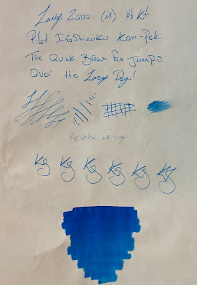
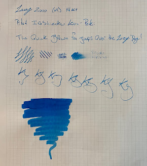
    Paper has been such a constant in eveybody's life that we tend to forget that not all paper is the same, not just whether its graph, lined, grid, etc. but also the qualities of the paper, how it deals with different pen types, the bleed through, the feathering, dry time and things of this nature. The difference in paper will be most clear when a fountain pen is used so for the sake of the comparison I'll be using the same fountain pen with the same ink on all the different paper in this example. The pen I'll be using is the Lamy 2000 in a medium nib size inked with Pilot Iroshizuku Kon-Peki which I feel are widely popular and an appropriate choice for the sake of this example. The paper brands I'll be comparing are Rhodia, Clairefontaine, Montblanc, Tomoe river, Mnemosyne, and the Write pad. 

Let's meet our competitors:


  • Rhodia- Arguably the most accessible brand I'll be comparing is Rhodia as they are available in an abundance of different types of stores, I've even seen them available in art stores and craft stores. The Rhodia brand offers a wide variety of sizes on 80 gsm paper and sometimes even 90 gsm paper however the 80 gsm seems to be more common. In 1997 Rhodia was purchased by Clairfontaine (another brand I'll be comparing later on) but some of the founder's family stayed on with the brand after this purchase, all Rhodia pads are made in France just like in 1932 when the brand was founded and still known as the Verilhac Brothers. 

  • Clairefontaine- Another staple of French paper manufacturing is Clairefontaine who, as I mentioned earlier, acquired Rhodia relatively recently in 1997. Clairefontaine has been making paper in France for over 150 years and actually started their production in 1858. Unlike Rhodia, Clairefontaine is primarily offered in 90 gsm paper this means it will be a tiny bit heavier than the Rhodia paper. The paper comes in a couple different sizes but not as many unique sizes that a company like Rhodia provides, more of the usual spiral bound or cloth bound sizes.

  • Montblanc- Next we have a company that really needs no introduction, whether you are just starting your journey into the fountain pen hobby or are a seasoned veteran, you've heard of Montblanc. Arguably the most famous pen company in the world, Montblanc not only makes pens but also makes notebooks that are leather bound with 85 gsm paper sheets. While they are more expensive, these notebooks aren't really meant for everyday note taking, in my mind they are meant for something like journaling or an activity that you want to keep a record of due to the high build quality and high end materials. 

  • Tomoe River- If you ask any fountain pen user their favorite type of paper there's a fairly good chance they'll answer with Tomoe River paper. Tomoe River paper used to be quite hard to get with only 1 or 2 vendors in the United States having it but is now widely coveted and available in the United States. The paper is unusually thin for fountain pen paper and is offered in 52 gsm and 68 gsm which are also relatively low for fountain pen paper. Despite the thin profile of each sheet, it handles fountain pens beautifully and really stands out amongst other brands due to the uniqueness of the product at hand. PenBoutique carries the Sakae Technical version of the loose sheets in A4 size in both plain and dot grid. It also comes in a pad or cloth bound notebook closer to an A5 size. This paper's lightweight feel isn't for everyone and some people opt for a thicker paper which is understandable because it takes some getting used to if you are used to writing on higher gsm papers.

  • Mnemosyne- Like Tomoe River paper, Mnemosyne is also a Japanese brand that offers exceptional experience while writing with a fountain pen. The paper is manufactured by Maruman and comes spiral bound in a variety of sizes and paper types including grid, plain and lined, the paper's weight is 80 gsm. This is a particularly good line of products for students and business people because each page has a dedicated space for a title and date making it good for taking notes in class or a meeting. The Maruman brand has been in the business for over 90 years and their dedication to the quality of their product is reflected in this fact. 

  • Write Notepads- the last brand that will be included in this comparison is a local company from Baltimore that makes quality notebooks out of environmentally friendly materials like vegetable based dyes, premium cover stock and 110 gsm paper. The heavy paper makes these notebooks a good option for drawing as well as note taking. Most of their offerings are spiral bound but they also have a classic hardcover version of a notebook as well. The brand is an off shoot of a book binding company and their three generations of expertise in the subject shine through in the quality and craftsmanship of their notebooks.

Putting Them to the Test:

Below are the pictures of the samples I created on each brand of paper listed with the same pen and ink to make it a good comparison of how the same pen acts on different paper. 

Rhodia:

Clairfontaine:


Montblanc:

Tomoe River:


Mnemosyne:

Write Notepads:


Show through/Ghosting:

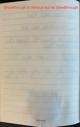
Show-through is an important aspect of paper because it affects the legibility of the back of the paper, if you can see everything from the front of the page on the back it may be harder to read. Show-through is different than bleed through because show through just means the other side of the page can be seen, bleed through is an over saturation of ink that comes through to the other side of the paper. 

Brands

Show-Through

Feathering

Dry-Time

Paper Texture

Price

Rhodia

Low


Clairfontaine

Medium


Montblanc

High


Tomoe River

High


Mnemosyne

Low


Write Notepads

Low


Best in category: Write Notepads

The reason they win the bleed through test is because they are the thickest and heaviest paper out of the bunch at 110 gsm. This means that there is more paper behind the ink to absorb so it doesn't even show through the other side. Even with the swab of ink it can't be seen from the other side, only leaves a slight warping where the swab was applied. This makes the write notepads a strong option for people drawing with their fountain pens whether you need a sketchbook or you draw while you journal, the low bleed through allows you to have crisp clean pages on each side of the sheet.

Feathering:

Feathering can be very annoying when using a fountain pen and luckily most higher quality paper tackles this issue quite nicely. Feathering is when ink from what you are writing spreads from the line you drew making the line appear messy and more broad than the nib size you may be using. When using a fountain pen there a bunch of different nib sizes and you want those to be true, not be ruined by feathering making your line appear messy and not as crisp.

Brands

Show-Through

Feathering

Dry-Time

Paper Texture

Price

Rhodia

Low

light


Clairfontaine

Medium

light


Montblanc

High

light


Tomoe River

High

light


Mnemosyne

Low

light


Write Notepads

Low

light


Best in category: Mnemosyne

It was really hard to pick a winner for this category because all of the paper performed so well and had light feathering. You could really pick up any of these paper brands and not have to worry about feathering but Mnemosyne edged it out just a little better with clean and crisp lines. Mnemosyne paper is right around the same weight as Montblanc, Clairefontaine and Rhodia so the difference is by no means major but performs a tad bit better in terms of feathering than those other brands. But again, you don't really have to worry about feathering with any of these brands.

Dry Time:

Dry time is probably one of the most noticeable things when using a fountain pen especially if the pen being used has a high ink flow. Paper needs to be absorbent but this is a fine line to walk because if its too absorbent it can lead to feathering and bleed though. Fountain pens by nature are going to take longer to dry than something like a ballpoint which is virtually dry once it hits the page so a quick dry time is better to minimize smudges and messy hands or paper.

Brands

Show-Through

Feathering

Dry-Time

Paper Texture

Price

Rhodia

Low

light

medium


Clairfontaine

Medium

light

low


Montblanc

High

light

low


Tomoe River

High

light

medium


Mnemosyne

Low

light

low


Write Notepads

Low

light

low


Best in category: Clairefontaine

To test the dry time I wrote Dry Time Test and then timed it after I completed writing the three words, Clairefontaine dried in 8 seconds which is quite good. This problem can also be combated with a blotter sheet or a hand held blotter so if a paper has medium dry time there is a solution to prevent smudging and ink spreading. The other paper with low dry times dried only a second or two after the Clairefontaine so again, no huge gaps between all the low dry time papers.

Paper Texture:

Paper Texture and weight affect not only the thickness of the paper but also the behavior of a fountain pen on that paper. Something with a higher weight in gsm (grams per square meter) will likely be smoother than something with a lower weight. Usually you see really high gsm with art paper meant for watercolors or markers so higher gsm is also better for drawing or painting. This doesn't necessarily mean that a paper with a higher gsm is definitively better but simply that the paper will perform differently, high quality paper comes in a variety of gsm so lower doesn't mean worse.

Brands

Show-Through

Feathering

Dry-Time

Paper Texture

Price

Rhodia

Low

light

medium

80-90 gsm / smooth


Clairfontaine

Medium

light

low

90 gsm / smooth


Montblanc

High

light

low

85 gsm / smooth


Tomoe River

High

light

medium

52-68 gsm / smooth but thin


Mnemosyne

Low

light

low

80 gsm / smooth


Write Notepads

Low

light

low

110 gsm / very smooth


Best in Category: It depends

While looking at this table above the clear winner would be write notepads however the reason I didn't pick them is due to the fact that people may need or prefer different weights of paper and smoothness. Tomoe River paper for example, is the lightest and thinnest paper in the list and is beloved by many due to its thin but well behaved sheets but the thinness makes it a polarizing feature that people tend to love or hate. The same could be said about the write notepad being too thick or smooth for some people or nibs. This category is more based on a personal feel and preference so its hard to pick one that is the "best".

Price $-$$$:

Now to arguably the most important point when comparing any product, the price. High quality paper does not have to be expensive, it's going to be a little more than loose leaf from an office supply store but we do still carry some reasonable options that are packed with value for the price.

Brands

Show-Through

Feathering

Dry-Time

Paper Texture

Price

Rhodia

Low

light

medium

80-90 gsm / smooth

$1.60-25.95

Clairfontaine

Medium

light

low

90 gsm / smooth

$3.95-$12.00

Montblanc

High

light

low

85 gsm / smooth

$44-$140

Tomoe River

High

light

medium

52-68 gsm / smooth but thin

$11.40-$29.00

Mnemosyne

Low

light

low

80 gsm / smooth

$6.80-$15.00

Write Notepads

Low

light

low

110 gsm / very smooth

$8.99-$24.00


Best in category: Rhodia

The sheer amount of different sizes, binding styles, and the choice between 80-90 gsm on some of their products makes Rhodia the best price value. They are also more widely available than the other brands mentioned because I've seen them at pen stores, art stores and craft stores. The other brands here aside from the obvious price jump for Montblanc are also great values for the quality of paper and unique feelings and performance they each provide. This is not to say the Montblanc notebooks are in anyway bad, they are a luxury brand and the price reflects this fact, they also come in interesting themes to go with some of their limited edition pen models making them a good choice for a dedicated journal or something that you want to keep for years to come.

Overall:

You really can't go wrong with any of the paper brands I mentioned, most of them are over 50 years old which should tell you the level of quality they've grown to expect and provide in their products. There is something here for every price point whether you're looking for quality everyday items or a luxury products for special occasions or journal keeping! No matter what you pick, enjoy it and keep writing!
-Kyle