Thursday, November 14, 2019

Montblanc's New Great Character collection is - Walt Disney -

Montblanc Great Characters: Walt Disney


Something huge that was apart of my childhood, and the childhoods of many other children growing up over the last 96 years was and is Disney. Disney brought out imagination, creativity, and magic to life and it has become a legacy around the world. From their adaptations of well known fairy tales, to the well loved Mickey Mouse, Disney has had a place in our hearts and dreams.


   This month Montblanc released a pen inspired by Walt Disney, as a part of their Great Characters collection. When you wish upon a star, I guess dreams really do come true. This is definitely a sleek, innovative pen that reflects the beloved Mickey Mouse.


Mickey Mouse was originally not a mouse. Originally he began as a rabbit, known as Oswald. Oswald became popular very quickly, and they began making a series of shorts for him. Sadly, the studio ended up taking the rights for Oswald, and Disney and Ub Iwerks, one of the animators who stayed with Disney,  stayed together to create Mortimer the mouse. However, Mortimer did not end up being as popular as Oswald. He ended up changing the mouse’s name to Mickey, who at first was also not gaining any popularity. Then “Steamboat Willie” happened in 1928. It was the first time both music and sound effects were both used at the same time, and it was a hit. A few years later he received a makeover, and has been around since being the adorable mouse that he is.


  Montblanc wanted this pen to be inspired by such a legacy, and it’s color choice for the barrel is actually inspired by “Steamboat Willie”. The design of the pen is also inspired by the famous Monorail system at Disneyworld in Florida.


The barrel and cap are made from black precious resin, and have hidden mickey ears all over the barrel, as well as a 3D resin molding integrated into the barrel. Walt Disney’s signature is also featured on the cap. A very interesting part of this pen is that at the cone there are a set of coordinates engraved to represent where the position of the garage belonging to Walt Disney’s uncle was. This garage is celebrated because it is where his brother created a camera stand.There’s also a yellow accent ring around the thread and barrel, as well as a red ring around the cone to represent Mickey’s iconic outfit.


This special edition pen comes in a fountain pen, rollerball, and ballpoint. There is a limited edition fountain pen as well, that is similar in shape and size, but has blue and black laquer inlays with the Mickey Mouse portrait in scanimation effect. Scanimation, which is also called a “kinegram”, creates a picket fence animation. This effect was invented in the late 1890’s, and then a man named Rufus Butler Seder brought it back to life. This is the first time Montblanc has used this effect.


Alongside the release of these pens are the notebooks and inks. The inks are a bright yellow, which is inspired by the shoes of Mickey Mouse.


I do personally think that the pens look a lot better in person. You really get to see all the fine detail, that can be a lot harder for a camera to capture. It has a good weight to it, and feels decent when writing with it. The only deal breaker for some people, however, is that it sadly does not post. I do really enjoy the texture of the barrel, and it doesn’t seem to be bothersome when writing with it.

This pen is perfect for all of us Disney enthusiasts and collectors, and such a magnificent way to remember and celebrate the truly great character that is Walt Disney.


Read more »

Tuesday, November 12, 2019

Fine pens which compliments the Autumn!

Fall is here and it’s starting to finally feel like it!  We here in the pen community love our seasonal themed pens, inks, and stationery. With fall comes a new season and some nostalgia. Today I thought I’d list and go over some fun products that are great for this upcoming season, new and old.

 First, we have the new Pelikan Star Ruby.

  The Pelikan Star Ruby is a special edition pen inspired by the gemstone: star ruby. Star Rubies are found to be rare because it can be difficult to find high-quality ones that fulfill both the vibrant color and the star reflection that it is known for.

They are mined from a variety of places: Sri Lanka, Burma, India, Africa, Cambodia, and the United States. However, India and Africa tend to be where more of the rare ones tend to be found.

The reason they are called “star rubies” is because when the light reflects off of it creates a six ray star. This is a phenomenon known as “asterism”.

I find that in person the glitter is definitely more prominent and the red/burgundy of the pen is a tiny bit brighter as well. It’s a great time for the release of this pen because it definitely suits the current and upcoming seasons/holidays! (It also has a matching ink, which would make a great gift set!)


Next up is the Estie Honeycomb.


       The Estie Honeycomb is a beautifully designed pen. While the name may remind us of summer, the colors that are brought out in this pen make me want me to curl up with a hot cup of tea (with honey, of course),a good book or my journal, and watch the leaves fall.

I love the way this feels in my hand and the way it looks. I personally think the gold trim is such a great accent to the rich and smooth warm golds/yellows blended into this pen.


Lamy Lx -Marron:


The Lamy LX Marron, also a recently released pen, is another great pick for the fall with its rich brown, autumnal tones. When I see this pen I think of chocolate or coffee. At a great price, you can’t go wrong with one of the Lamy LX’s. I, personally think that Lamy has a wide selection for a diverse amount of people, and really enjoy that aspect of their selection.


Now, if you’re like me, you love an ink that’s going to match either one of these pens, or your own fall collection. A couple of great colors, or what I think are great additions for fall, are Diamine’s “Autumn Oak, Pilot Iroshizoku’s “Momiji” (Autumn Leaves), and Monteverde’s Sweet Life “Pumpkin Cake”.

The “Momiji” is a deep red color, however it does lean more towards the pink side of the spectrum, depending on how it’s being used. It is a very saturated red, however, especially when written. It definitely reminds me of red leaves during this time of year!


“Autumn Oak” reminds me of a more fall orange: you know, pumpkins and leaves versus neon orange popsicles or summer. I think it can be dynamic without going overboard, and brings a fun and creative color to your writing palette.


Monteverde’s Sweet Life “Pumpkin Cake” is a rich brown color that, at least to me, has some orange slightly mixed in there. Now that it’s fall it’s kind of wrong to not have a pumpkin ink, right?


We also have some great stationary, too, to match with these pens and inks: The Rhodia Heritage notebooks and the recently added Field Notes Autumn Trilogy.


The Rhodia Heritage notebooks, which are limited edition,  immediately reminded me of the fall, especially the plaid patterned one! I am absolutely obsessed with this pattern and color scheme. For this line they have the Tartan, Checkered, and Escher designs in graph and lined.


We also recently got in the Field Notes 2019 Autumn Trilogy Notebooks! These are Limited Edition Notebooks. The colors they chose were “Warm Red”, “Safety Yellow”, and “Scarlet”. These colors are approximately the same color as the leaf colors of the American Sugar Maple, American Elm, and Scarlet Oak. Each notebook features a realistic debossed leaf from each specific tree. These are simple yet beautiful colors, and something small you can just throw in your bag.


Thanks for reading this week’s blog and I hope you enjoyed the variety of pens, inks, and notebooks we looked at!  Hopefully it’ll start to feel like fall soon!


Read more »

Friday, October 11, 2019

The Rhodiactive Hardcover Notebook is Brilliant

Being a full-time student, I have a need for sturdy, dependable notebooks well suited to notetaking. When I sit down at a lecture, I need to be able to quickly pull the relevant notebook out of my bag, open to the first unused page, and denote information about the lecture for future reference.

The hardcover Rhodiactive notebook was designed with these needs in mind. The book-bound construction circumvents the annoying tendency of spiral bound notebooks' spirals to interlock when they're adjacent in a bag. The unusual but surprisingly convenient inclusion of perforated corners makes finding the next unused page exceptionally easy and quick. Finally, the single isolated header line on each page makes the subject and date of the lecture stand out on the page and helps me find old notes when I'm just flipping through looking for a specific header.

Those are concrete reasons why I appreciate my hardcover Rhodiactive notebook. If I was recommending it to a friend and trying to sell its appeal, I'd focus on those points because they represent objective benefits. But my appreciation for the hardcover Rhodiactive goes way beyond the things that just make it a quality stationary product. There are so many little things that set the Rhodiactive apart and make writing in it an absolute joy.

For starters, Rhodia's line ruling is exceptionally wide, with abundant vertical space. This isn't exactly a universally popular trait, as a significant amount of space is wasted if you're used to writing on college or narrow rule paper or just have small handwriting. As someone with relatively large print and a love of ink, I love using the wider rule offered by Rhodia, because I can justify using broad and stub nib pens that put down more ink without compromising legibility.

The author's progress at the time of this writing
The perforated corners are obviously convenient for finding the next unused page and remove the hassle of making sure the integrated bookmark is properly placed every time you put away the notebook, but I find they make using up the notebook exceptionally fun. We all know the satisfaction of putting the used portion of a notebook between thumb and forefinger and appreciating the thickness of the pages we've filled. With the perforated corners, every time you fill a new page you're reminded of the journey that is filling a notebook. You pull off the little tab with its satisfying pop pop pop of tearing perforations and are filled with a profound sense of accomplishment at having gotten one step closer to conquering the 98 sheets of pristine stationary you started with. This is a powerful form of positive reinforcement, and I've found myself taking unnecessary notes on readings for the class I use it in as an excuse to tear off those little tabs.
Although the space for filling out the owner's contact information is something you ideally never need, it gives me a sense of security knowing that if some good Samaritan should find my notebook, they'll have 5 different ways to reach me and return it. I'm in the habit of providing contact information on the inside cover of my notebooks regardless of the provided space, but the included blanks reflect a bottom-up design approach that values convenience of use.

In case I get hit by a bus on campus
While the inclusion of the space for contact information and the metric conversion chart on its reverse are greatly appreciated, the inside cover has some odd elements. The perpetual calendar provided opposite the contact information has such tiny squares for each day that I can't imagine writing much more than a weekday abbreviation in each one. I see the utility of being able to see the day of the week for a given date, but filling it in would be a chore, and on most occasions when you need to see the day of the week on a future date you also need your schedule for the sake of making plans. On the contact information sheet, 'personal email' is spelled 'personnal email', a flagrant typo. The French for 'personal email' is 'email personnel' according to the cross-labeling below the English, which suggests this isn't really a typo so much as lazy translation on the part of some designer at Rhodia's headquarters in La Défense, France. The cross-labeling is oddly inconsistent, with terms like 'capacity' being provided in French with exact cognates like 'volume', but with 'USA Dry Measure Equivalents' receiving no French translation. 

The world map on the inside back cover shows time zones, and is
 interestingly centered on the Pacific Ocean instead of the Atlantic
All told, this is possibly my favorite notebook for the role it fulfills: large, durable, A4 notebook I can throw in my bag without worrying about it. Its French origin leads to some interesting quirks, but the inclusion of the preprinted pages inside the front and back cover improves its utility and definitely helps the Rhodiactive hardcover stand out in a market where competing products can be extremely similar.
Read more »

Sunday, September 8, 2019

Montblanc Calligraphy pen series launch and Flex nibs.


Calligraphy  /kəˈliÉ¡rÉ™fÄ“/

“Decorative handwriting or handwritten lettering”


A quick review about Montblanc new Flex nibs !


       What an exciting summer it has been, and how even more exciting that it’s ending with the release of the Meisterstück Calligraphy Pen Collection! However, we all know that the real excitement, or curiosity, is about their new and creative flex nib (made of pure solid 18k gold) inspired by their well known design from the 1950’s. Their flex nib is supposed to create lines of different varieties, from very broad to extra fine (depending on the pressure you use) while maintaining its smooth and feel-good sensation.


     It took a decent amount of time to design and complete this masterpiece of a nib (approximately 3 years between 35 skilled designers and craftsmen/women). The flex nib is offered on the Meisterstück Solitaire Gold Leaf and the classic black/gold Meisterstück 149.  The flex nib has a new symbol from Montblanc and is also engraved on the nib.


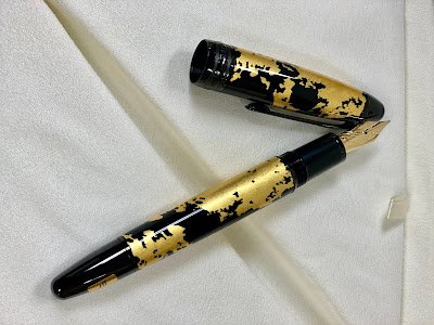
     The Meisterstück Solitaire Gold Leaf is wrapped in real gold leaf, which is all hand applied, creating a unique design on each pen. This pen takes a mesmerizing spin on the classic black and gold colors we all well know from Montblanc. It also features a full black PVD  coated clip and three full black PVD rings with the Montblanc brand name embellished on it. It’s also offered as a rollerball and in the calligraphy nib, which is a hand-crafted Au750/18K gold ruthenium-coated nib. The barrel is a black translucent  lacquer topped with a black lacquer cap.


      The idea behind this pen is to bring out the rich history of the art of writing, and to embrace this through the calligraphy nib. Calligraphy is a form of art that has reached all parts of the world, and can have different meanings amongst different cultures. For example, in China, calligraphy is seen as more than just a form of art. It’s a form of self-expression, personality, and success.


   How amazing that art and writing are expressed so differently and uniquely amongst all cultures, yet brings people together all over the world? From first glance at the Solitaire Gold Leaf I thought it looked like there were different continents placed on the pen. Due to the gold leaf being hand applied, it’s like each pen has a new world on it to discover.

What a neat and beautiful contribute to the art and history of calligraphy, as well as a unique take to the classic Montblanc design.

Comparison:

The Montblanc 149 fountain pen is a large fountain ( largest of the Montblanc fountain pens also thicker) and the 146 also known as LeGrand is a size smaller.  The filling mechanism is piston fill.

Below picture the comparison is between the 149 flex, 146 gold leaf flex, Marlyn Monroe Muses and Montblanc Boheme.


 More resource and video: 


 To get in-depth we have also created a video. Check it out.


 By - Amber


Read more »

Sunday, August 11, 2019

Fisher Space Pen Apollo 11 Astronaut Ballpoint Pen (Special Edition)

Fisher Space Pen Apollo 11 Astronaut Ballpoint Pen (Special Edition)


We meet in an hour of change and challenge, in a decade of hope and fear, in an age of both knowledge and ignorance. The greater our knowledge increases, the greater our ignorance unfolds." - President John F. Kennedy
When John F. Kennedy challenged America to land a man on the moon and return him safely back to earth by the end of the decade, he kick-started what would be one of the most inspiring and difficult undertakings mankind has ever attempted. Space was a new frontier, filled with hazards and challenges yet unknown. This bold and daring pursuit has inspired millions, and continues to inspire tomorrow's scientists, engineers, and astronauts. Neil Armstrong’s first steps on the moon truly were a great leap for mankind, as they represented our escape from the confines of the earth in spite of the huge hurdles to space exploration 
These hurdles ranged from the grand questions of propulsion and life support to the more pedestrian considerations of how astronauts would eat or write in space. Finding a writing implement suitable for use in the testing environment of space turned out to be surprisingly difficult. The ballpoint pens available at the time required gravity to maintain consistent inkflow, and had issues with excessive outgassing of ink vapors into the small confined space of a command module. Pencils generated broken tips and fine graphite particulate that would float around in microgravity and present a hazard to both the crew and the sensitive electronics keeping them alive.
The need for a suitable pen was met by Paul Fisher of the Fisher Pen Company. Through a common sense design process, he developed the original Fisher Space Pen: the Anti-Gravity 7 (AG7). Capable of writing perfectly in all manner of challenging conditions encountered in space and on earth, the AG7 was designed expressly with the needs of the Apollo astronauts in mind.
Fisher pitched the AG7 to NASA, and after 18 months of rigorous testing, it went up with the Apollo program’s first manned spaceflight, Apollo 7, on October 11th, 1968. The same AG7 design has been carried by NASA’s manned spaceflights ever since, most notably the Apollo 11 mission that carried Neil Armstrong and Buzz Aldrin to the moon.
This Special Edition Fisher Space Pen AG7 commemorates the 50th anniversary of the Apollo 11 mission that brought man to the lunar surface and back for the first time. The pen itself is the same AG7 design used by the crew of Apollo 11, but also features unique engravings celebrating the first moon landing. These include the Apollo Command and Service module that carried the crew across the vast translunar gulf, “Man’s First Moon Landing” with the date, “Jul. 20 1969”, and an “Apollo 11” incorporating the button used to retract the pen’s tip as the second “O” in “Apollo”, along with other small astronomical motifs.
As a genuine Fisher Space Pen of the same variety as those used on the Apollo missions, this pen stands out among those commemorating the first moon landing. While other moon landing themed special editions exist as monuments to the achievements of the Apollo program, the AG7 is part of the story of the moon landings, and was present for the landing itself as much as Neil Armstrong or Buzz Aldrin. Not only is this pen a beautiful tribute to mankind's giant leap and the power of bravery and ingenuity to make possible things once confined to the realm of science fiction, but it's also an opportunity to own a piece of history.


Ben goes in length as to why Fisher Space pens mechanism and why the 50th Year anniversary edition for Moonlanding is even more enticing.


Read more »

Wednesday, June 12, 2019

© 2016-2018 Pen Boutique.com. All rights reserved Privacy Policy Terms of Use