Tuesday, October 28, 2014

Sheaffer Taranis Fountain Pen Review

Sheaffer Taranis Fountain Pen
Most recognizable by the signature white dot which adorns the clip, Sheaffer has long been a respected name in the world of pens.  Sheaffer collaborated with famed US architect Charles Debbas to bring us the Taranis line of pens.  Debbas has taken his characteristic feature – minimalism – and melded it into this line.  The overall shape and design of the fountain pen when capped is the definition of minimal, with a rounded middle slowly shifting to squared ends on either side.  The clip is rectangular and fits nicely with the aesthetics of the body.  Uncapped, the user is greeted with a front section adorned with the Sheaffer name (hidden when capped, no doubt to keep in the vein of the minimalist aesthetics) and a hooded nib, which helps keep a tidy and simple appearance.  The fountain pens are compatible with Sheaffer converters and Skrip cartridges, both of which are included with the pen.  The Taranis line is also available in Rollerball or Ballpoint, and in five different colors – Stormy Night (black), Icy Gunmetal (grey) or Sleek Chrome (silver) with chrome trim, and White Lightning (white) or Stormy Wine (burgundy) with gold trim.

The Sheaffer Taranis fountain pen is well balanced, and it felt most comfortable while using it posted.  The nib is smooth – it reminds me of a Pilot/Namiki Vanishing Point both in feel and looks.  If I were to nitpick, it does seem to be a little on the wet side with a Medium nib though nothing that would keep me from using it as a daily writer.  The front section where the Sheaffer name is present is flat and I found it to be a good resting place for my pointer finger while in use.  It is nice that a converter is included, as not all fountain pens come with one, especially as it is proprietary to Sheaffer pens.  This is my go-to suggestion when someone is looking for an affordable pen as it blends great writing performance with modern styling.

While it is aesthetically an unassuming pen, the Sheaffer Taranis is one of the smoothest writers I have used.  If you are looking for an understated daily pen with a fantastic nib, the Taranis is hard to beat.

- Joe (Pen Boutique Limited, 5560 Sterrett Place, Columbia, MD 21044)
Read more »

Tuesday, October 21, 2014

Sailor 1911 Fountain Pen Review

Sailor 1911 Fountain Pen
Sailor 1911L Fountain Pen
In 1981, Sailor introduced their 1911 series as a celebration of the company’s founding in its namesake year.  The line can be had in a number of different sizes, shapes, colors, and nib configurations.  The 1911L, which stands for Large, is a step up in size from the 1911S (Standard) both in diameter and length.  Other than the nib, clip, and decorative rings, the pen is made entirely of resin.  This imparts a light weight that is easy to handle, even in this larger iteration.  The 21k Gold nibs range from Extra Fine all the way up to Music, and includes Sailor’s Medium Fine for those that find the Medium too broad but the Fine too thin.  The 1911 series traditionally uses either cartridges or a converter, though Sailor has recently created the piston filled Realo line.  Both the cartridges and converter are proprietary Sailor designs, and the cartridges are available in Black, Blue, Blue/Black, Red, or Pigmented Black or Blue/Black.  The pigmented inks are waterproof, but extra care should be taken when using these as the tiny particles that cause this characteristic may create issues if the pen is not used or cleaned regularly.
In general, Sailor’s nibs tend to run a size smaller than a Western counterpart – i.e. the Fine writes like an Extra Fine, the Medium writes like a Fine, etc.  In testing a Fine nib, I found this to be true as the pen laid down a very thin line.  Despite the Extra Fine-like width, the nib was smooth, no doubt aided by the 21k Gold construction.  The pen was comfortable to use both posted as well as with the cap left off – another advantage of the light weight.  The larger size compared to the Standard version allowed for a solid grip without much effort, which is something I have come appreciate when having to write for long periods.  I did notice that the nib had a little flex to it, lending a slight variation to line widths if I was so inclined.  This led to a line that was more akin to a Western Fine.
The 1911L looks good and writes well.  Sailor has done a fantastic job in creating a piece that is large enough to use comfortably yet light enough to not fatigue your hand while doing so.  If you are looking for a thicker pen with a smooth nib and classic good looks, the 1911L should definitely be at the top of your list.
- Joe (Pen Boutique Limited, 5560 Sterrett Place, Columbia, MD 21044)
Read more »

Wednesday, October 15, 2014

Pilot Namiki Iroshizuku Fountain Pen Bottle Ink

So much ink and so little time .Not fair.
Seventeen colors from a single manufacturer, that’s a lot of ink . I wish I could use every color with my Namiki Vanishing Point Fountain Pen (Broad Point). Slowly, I will fulfill that wish but right now I tried a few colors that looked very appealing to me.
So I started my quest of filling the so called Pilot Namiki Iroshizuku Ink Bottle to know what the buzz is all about.. First I filled the pen with tsukushi(Field HorseTail) . This is a Reddish Dark Brown colored ink . Namiki Vanishing point Fountain Pen comes with converter . Now the best part about a converter with a nib is that we can have different converter filled with different colored ink and that helps to avoid cleaning the nib when you want to change the color of ink. Hats off to Pilot Namiki to bring in this technology which helps fountain pen lovers to try different color without having to undergo the pain of cleaning the nibs. I started to write in my to-do lists of Filofax Finchley Filled Organizer Pocket Size Black
clip_image002
The drying time of the ink is little high when compared to other inks. But again that depends also on the paper used. On the filofax organizer paper ,it took around 3-4 seconds to dry and on an ordinary white paper,it took lesser time to dry.
These luxurious line of ink from Pilot Namiki were created to reflect the beautiful natural scenary of Japan ,different local flowers and fruit. The bottle is truly gorgeous and will fill your fountain pen with different colors for different season.Try Winter with Old Man Winter (fuyu-syogun) ,summer with Deep Cerulean Blue or Sunset (yu-yake) and Fall with Autumn Shower (kiri-same) or Autumn Leaves (momiji)
1) Tsuki-yo Night Sky (Greenish Deep Blue) would compare it to the Blue-Black Color . It contains more Green to be called a genuine blue-black.It has a moon-ish color . (“tsuki” means moon ).
2) Tsukushi Field Horsetail - This is the ink that matches the color of my Namiki Vanishing Point Fountain Pen.It is nice chocolate based brown and there is bit of reddishness in the color.Its based on a grass named horsetail which is basically green in color .But the color which Pilot thought about when making the ink was dried horsetail.( I don’t know…iam just guessing it wild(weed?))
3) Asa-gao Morning Glory (Vivid Purplish Blue) . The first color that came in my mind when I saw it was the the J. Herbin's Eclat de Saphir. I put 3 drops on a J Herbin Blotting Paper
clip_image004
One observation of the ink is that it is not as viscous as J Herbin ink.
The color is based on the flower Morning Glory found in Japan . This flower was introduced to the Japanese in the 9th century, and they were first to cultivate it as an ornament
clip_image006
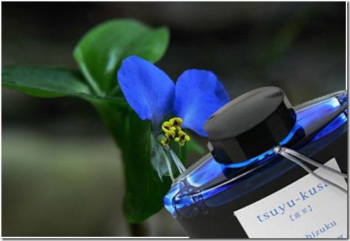
4) Tsuyu-kusa Asiatic Dayflower
Based on the flower shown below .It is considered to be in the weed family but is also consumed as leaf vegetable in Japan and other countries in Southeast Asia.
clip_image008
5) Ajisai Hydrangea – this shade of blue is reminiscent of the image of raindrops nestling on its petals.
clip_image010
The color of this ink is based on the flower Hydrangea which blooms during early spring to late autumn .There are many varieties of this flower with different colors.Out of that the following varieties are found in Japan Hydrangea hirta, Hydrangea involucrata, Hydrangea macrophylla and Hydrangea serrata. Hydrangea is a common flower in China than Japan.
6) Kon-peki - Deep Cerulean Blue - expresses the color of a vast and clear summer sky.
clip_image012
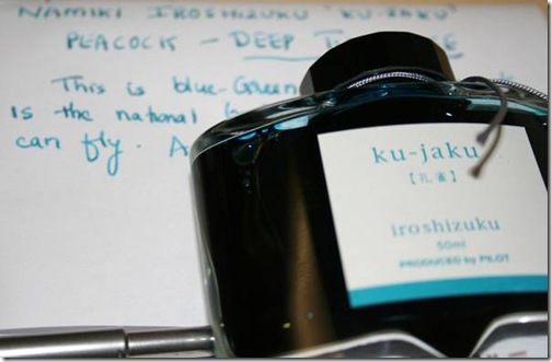
7) ku-jaku Peacock – a green color which evokes visions of the stark and vivid feathers of the richly multicolored peacock.
clip_image014clip_image016
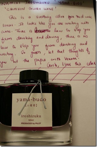
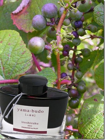
8) Yama Budo Crimson Glory Vine – this red embodies the bright and ripe fruit of the wild, yet subdued crimson glory vine. I wish they made wine with this vine. The fruit resemble red grapes..but it is not red grape.The color is an exact match to red wine.
clip_image018clip_image020
9) Tsutsuji - Azalea – a red hue like the common red amongst the myriad hues of the Azalea flowers.
Are you a Sagittarian? This ink may bring you luck. The color of the ink is based on the flower Azalea which is the flower for astrology symbol Sagittarius.
Amazing snap of Azalea in mountainous region of Japan.
clip_image022
clip_image024
10) Yu-yake Sunset – an orange hue like sky, painted by the evening sunset on clear day.
There are no more apt words to describe sunset than the poem by Victor Hugo
Synopsis of the poem
I love the evenings, passionless and fair, I love the evens,
Whether old manor-fronts their ray with golden fulgence leavens,
In numerous leafage bosomed close;
Whether the mist in reefs of fire extend its reaches sheer,
Or a hundred sunbeams splinter in an azure atmosphere
On cloudy archipelagos…………..

All vanishes! The Sun, from topmost heaven precipitated,
Like a globe of iron which is tossed back fiery red
Into the furnace stirred to fume,
Shocking the cloudy surges, plashed from its impetuous ire,
Even to the zenith spattereth in a flecking scud of fire
The vaporous and inflamèd spaume.


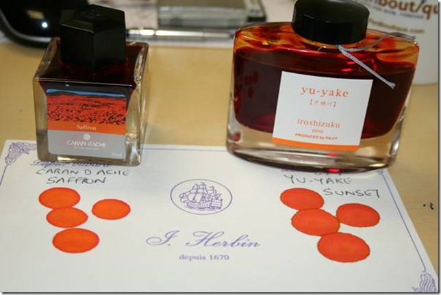
Caran D Ache “Colors of the Earth” Ink Bottle with Saffron color is very much similar to the color of Yu-yake.If you are a color freak,this one should find a place in the collection .
clip_image026


This is the second color that iam testing on Blotting Paper . If you look closely into the ink of Pilot,it looks like it is more watery than other inks. This may be the reason why Pilot Namiki’s ink is more smoother while writing.
11) yama-guri Wild Chestnut – a brown color similar to the image of a ripe, fallen chestnut shell during the longing season of autumn.
clip_image028
12) fuyu-gaki Winter Persimmon –The color of this ink is based on an orange similar to the shade of a lusciously ripe persimmon.
clip_image030
Now there is an interesting fact about Winter Persimmon. According to folklore (which means it hasn't been scientific proven, or disproved), the severity of approaching winter can be cutting open a persimmon seed and looking at the shape of the kernel inside. Hold the seed carefully with a pair of needled-nose pliers and use a paring knife to slice it open.
If the kernel is spoon-shaped, lots of heavy, wet snow is forecasted.
If the kernel is fork-shaped, powdery light snow and a mild winter is predicted.
If the kernel is knife-shaped, bitter icy cutting winds for next few months will occur.
It is recommended to cut at least ten seeds to determine the outcome of the kernel shape.
Iam glad that Pilot had one color which is based on Edible fruit.
clip_image032
13) syo-ro Dew on Pine – a green shade similar to a dewdrop reflecting pine needles.
14) shin-ryoku Forest Green – embodies the unchanging color of a dense evergreen forest in a long winter.
15) kiri-same Autumn Shower – a grey shade like a landscape expectant of winter.
16) fuyu-syogun -Old Man Winter – a grey conjuring up the image of the cold, clear air of the severe winter season.
17) Shin-ryoku –Deep Green – The inks are based on the flower and the natural beauty of Japan. So this ink
The bottle is cleverly done. It’s pretty tall and narrow .It holds 50ml of ink. The opening of the bottle is also quite wide for bigger pens to be dipped or filled. There is an triangle shaped depression in the bottom of the bottle (as shown in image below) which allows us to enjoy the last drop of ink(afterall we need to get that last drop as the ink is not cheap)
clip_image034
Colors are saturated and lubricated
In short this can be rated as one of the most beautiful ink ever produced (I know lots of MontBlanc ,Aurora or J Herbin ink lovers would be raising their eyebrow on this comment, at least the bottle deserves credit..come on) .The ink costs $35 a piece but we give a 20% discount and sell it for $28. Just for today/tomorrow ie October 15th 2010,for the agony of reaching until here reading my blog,I am giving additional $3 off using coupon code JAPAN3 at checkout.
Well..that’s a lot of writing and in the end , like the ink or not..I think I started liking Japanese..:)
Read more »

Tuesday, October 14, 2014

Porsche Design TecFlex Fountain Pen Review

Porsche Design TechFlex Fountain Pen
Porsche Design TecFlex Fountain Pen

The Porsche Design TecFlex Fountain Pen is a head turner.  One can’t help but notice the basket weave design of woven stainless steel covering the body of the pen.  This design is reminiscent of the protective cabling used for the fuel and brake lines on Porsche automobiles.  The non-weave portions of the pen are Palladium coated.  The nib is rhodium plated 18k white gold and is available in Fine, Medium or Broad.  A converter is included, though the pen is also compatible with international size cartridges.  The TecFlex line includes three different color schemes – stainless steel, stainless steel and gold, and black.  They can be had in Rollerball, Ballpoint or Pencil.  The Ballpoint and Pencil are worth noting as their weave actually compresses when extending the refill or lead – very cool.

The TecFlex Fountain Pen has a good weight to it – not too heavy, but not too light.  It is also a good sized pen and is comfortable in the hand.  The weight does seem to be concentrated to the rear, so I found it more balanced to leave the cap un-posted while writing.  The 18k gold nib is a pleasure to write with, though it does seem to lay down a wet line.  That being said, it is smooth as silk and starts and stops on command.  The rear of the pen has three small protrusions, resembling ball bearings, which keep a sturdy hold on the cap when posted.  This is easily one of the most attractive pens I have had the pleasure of handling and testing.

If you are a car buff, or know someone who is, the Porsche Design TecFlex line is hard to beat.  It looks good, writes well, feels substantial and has design cues taken straight from their vehicles!  Even non-buffs will appreciate the workmanship and style that have gone into this line.  Since the TecFlex is offered in all four writing styles, this line should be able to fulfill the requirements of anyone looking to add a quality piece to their collection.

- Joe (Pen Boutique Limited, 5560 Sterrett Place, Columbia, MD 21044)
Read more »

Delta Dolcevita Skeleton Limited Edition Fountain Pen Review

Delta Dolcevita Skeleton Limited Edition Fountain Pen

Are you looking for the perfect October pen?  Take a good look at the Delta Dolcevita Skeleton Limited Edition fountain pen.  The gorgeous orange resin marbling with the black rhodium coated metal cage-style overlay looks like something from Dr. Frankenstein.  There is a clear demonstrator version with the black metal rhodium coating, which is nice to see the ink and piston filler, but I prefer the classic orange and black for looks.

The metal overlay does not interfere with comfort when writing.  The stainless steel nib is fused with 18K gold making for a striking nib design.  It is very smooth and doesn't grab the paper when writing.

The cap is a screw on, both to open/close the pen and to post.  The size of 5 9/16" x 5/8" makes it pleasant to hold and to fit in most pen cases with ease.  It is a heavier pen at 1.8 ounces. The rear top piece unscrews to allow access to the piston filler knob.
It is limited to only 888 pieces and the serial number is on the rear of the cap.

Pair this pen with Diamine Autumn Oak ink and you have a great pen to write your October notes and Halloween greetings with.  This pen is definitely a treat, not a trick.

- Joy (Pen Boutique LTD, Suite 115, Columbia, MD 21044)
Read more »

Pelikan M101N Tortoise Fountain Pen Review

Pelikan Souverän M101N Tortoisehell Red Fountain Pen

For the collectors amongst us, Pelikan began issuing the Special Edition M101N series as a throw-back to a line that was originally introduced in 1937.  Now in its third Special Edition iteration, the Pelikan Souverän M101N Tortoisehell Red is the latest version to come out of Germany.  These Special Edition pens pay homage to the lines and shape of the original piece while utilizing the best in modern technology and materials.  The body itself is made of cellulose acetate and has a somewhat striated design with differing shades of brown inlaid on an almost creamy parchment brown.  The cap, front section and rear section are a red resin and help to set the piece apart from the more subdued colors of the other two Special Editions.  The nib is 14k gold and, like their other pieces, is easily removed for cleaning/swapping/etc.  However, these nibs do have a vintage looking engraving which sets them apart from normal Pelikan nibs.  The pen is piston filled and for a limited time will have a bottle of Pelikan 4001 Blue ink included.  There will be historic font lettering on the bottle and presentation box.

In a collection that spans up to the extra large M1000, the M101 line is Pelikan’s smallest offering.  It is a handy pen, something that could easily be put into a shirt pocket or bag and be available at a moment’s notice.  It is also a light pen, mainly due to the materials from which it is manufactured, so it shouldn’t be a burden when carried.  The large ink reservoir window aids in keeping track of your ink supply and the 14k gold nib ensures a smooth ink-to-paper writing experience.  The removable nib helps to make certain that you have a completely clean pen when changing inks, something which will be of great value to those who like to change or experiment with different colors.  I found that holding the pen was comfortable with the cap either posted or completely off.  While the pen is shorter than most, I did not find its size to be a detriment to its use.

The M101N Special Edition Tortoiseshell Red fountain pen is a good addition to Pelikan’s growing stable of fine writing instruments.  It has taken a proven historic design and updated it for today’s demanding users.  For those that like a vintage look with the added benefit of modern manufacturing or are just looking for a great writing pen, the Pelikan M101N Special Edition Tortoiseshell Red fountain pen should be high on your list of pieces to check out.  Make sure to act fast as the special Blue ink bottle is only available for a limited time!

- Joe (Pen Boutique Limited, 5560 Sterrett Place, Columbia, MD 21044)
Read more »

Saturday, October 11, 2014

International Day of the Girl Child 2014

What started as a “Because I Am a Girl” project of a non-governmental organization called Plan International, churned enough results to convince Canadian Federal government for support. They in turn proposed “International Day of the Girl Child”, a broader extension of the aforementioned campaign, as a resolution in the United Nations General Assembly. The outcome was 11 October, a date dedicated to girl children all over the world. Its purpose is to endorse girl’s human rights, shed light on the inequalities between girls and boys, and address the discrimination and abuses faced by girls.

Sticking to the purpose of the day, the first International Day of the Girl Child on 11 October 2012 was observed around the world with the theme “ending child marriage”. The second year saw the theme “Innovating for Girls’ Education”. This 11 October, it will be the third “International Day of the Girl Child”, and the theme for this year has been announced to be “Empowering Adolescent Girls: Ending the cycle of violence”. This year the day is focused on raising awareness about the importance of empowering adolescent girls and, preventing and eliminating every form of violence they are subject to.

Here are some facts and figures from UN to help you fathom the reality of violence, discrimination and inequality against girl child all over the world:


  • Almost 60 million girls are sexually assaulted at, or on their way to school, annually.
  • The same number of girls is estimated to go ‘missing’, mostly in Asia, as an outcome of infanticide, neglect or sex-selected abortions.
  • Among 800,000 people trafficked annually, 80% are women and girls. The majority among them are trafficked for reasons of sexual exploitation.
  • Up to 5% of women report being physically abused while pregnant. 
  • There are over 60 million child brides all over the world. The definition of married life for many of them is violence and abuse.

If the numbers penned above astounds you in anyway, choose to make a difference: Fight to eliminate inequality and discrimination between boys and girls, strive for girl education, raise voice against female infanticide, work to stop violence against girl child and do everything and anything in your power to ensure that girls are not ill treated in any form.

A day has been set, but do not treat it as any other day. Moreover, let us not forget about this subject during the remaining 364 days of the year. Don’t ridicule the purpose by sidelining it on other days. Let the goal be not only for 11 October but every day. Your voice counts, so let it be heard. All over the world, people gather together, men and women to organize events for awareness. Be a part of it and make a difference. And when it is not 11 October, keep fighting for girl children, their rights and security. It is a year-round responsibility that belongs to all of us. Let’s also keep in mind the HeForShe campaign that has been initiated by UN and call out all boys and men to join forces to support girl child and their rights. It is a movement that needs pushing from all of us to be indefinitely successful.

Read more »

Wednesday, October 8, 2014

Delta Vintage Stylus Review

Delta Vintage Stylus
Combining classic looks with modern technology, Italian brand Delta introduced the Vintage Stylus to its lineup.  The cap and front section are crafted from a marbleized resin, while the body is constructed from a brushed stainless steel.  At the rear of the pen you find a stylus which can be used with your smart phone, tablet, or anything else that has a capacitive touch screen.  The stylus is becoming more and more prevalent in the marketplace, though it does seem that most luxury brands are slow to integrate the technology.  The Delta Vintage Stylus gives fountain pen users (and rollerball users) the ability to use their beloved writing instrument with their favorite piece of technology.  Delta’s signature roller clip, designed with a wheel to help when placing the pen in a pocket, is an immediate clue to the pen’s lineage.   The fountain pen uses international size cartridges only.  The flexible iridium nib is available in Extra Fine, Fine, Medium or Broad.  The pen can be had in Lava Black, Burnt Orange or Deep Ocean Blue.

At 4 5/8 inches long uncapped, including the stylus, this is a small pen.  Posting brings the total length to a hair over 5 5/8 inches.  This short length explains why a converter is not an available option.  I find that the pen feels more balanced with the cap left off.  The front section allows a good purchase without having to clamp down.  The iridium nib gives a nice, smooth writing experience.  I did notice that just a slight amount of pressure was sometimes needed to get the nib flowing, but writing was effortless once started.  The stylus worked perfectly with my smart phone.  With the lightest touch I was swiping between menus and typing out texts.  It was also very precise – I was able to place the cursor between the exact letters I wanted to 9 out of 10 times (not something that always happens when I use my finger).  One thing I really appreciate about the stylus on this piece is that it is replaceable.  If any damage were to occur, you simply unscrew the stylus from the body and replace it with a new piece.  I would consider this a feature unto itself!

The Delta Vintage Stylus was a pleasant surprise.  It is a little short, a little light and cannot use a converter – but it is a good looking, smooth writing, multi-use fountain pen.  It easily slips into a dress shirt pocket, giving you a sophisticated look without breaking the bank.  With this line, Delta has successfully bridged the gap between old style and new technology.  If you’re in the market for a new pen, give consideration to the Vintage Stylus!

- Joe (Pen Boutique Limited, 5560 Sterrett Place, Columbia, MD 21044)
Read more »

Tuesday, October 7, 2014

Cross Torero Braided Black,Desert Diamond Black,Bordeaux Croc Fountain Pen,Rollerball and Ballpoint Pen

Guess what is the talk of the town( ofcourse I mean the town where pen is life,ink is water and so on )..Well,for starters ,I think it is MontBlanc Mark Twain pen which are getting sold out like the NFL football tickets . But we have a wild entry in the town..Its the new Cross Pens.
The pens hit our store more than 2 weeks back and ever since there has been lots of inquiries on the pen and the customers who purchased these pens having nothing to say about it other than good things. We sold out of the first stock we got from Cross and the next shipment just arrived today. The pens are online in our website and we get many inquiries about when this pen will be put in our deal of the day .You never know..keep an alert of the page on a daily basis.
Cross has released a new series named Cross Torero and Cross Edge and it is gaining popularity ,slowly but surely.
The peculiarity about Cross Torero is that the outside of the pen is covered in Leather.The grip of the pen is quite comfortable and you have a good feeling while writing it. I think many people would have doubts on the quality of leather and will it get worn out just like other leather products do. Does the warranty cover the leather? Cross did have a similar collection some time back in leather with their Cross AutoCross series.We haven’t heard any complaints about the leather of Autocross . So we believe the quality of the leather can be taken for granted. Afterall,Cross is an renowned company and would not release a product in market without rigorous testing.Also with Autocross, Cross had more variety of products like the Cross Wallet and Cufflinks. Cross discontinued the production of Autocross and they are not available any more in the market.
There are various colors available (one of them Bordeaux Croc actually looks like my Samsonite briefcase,I may get that to match by briefcase ).
I got curious about the name “Torero”. I googled it and came to know that a Torero is “a matador or one of the supporting team during a bull fight” . Well,why would Cross name its Pen as Torero? I never found the answer. If you have any idea,let us know.
Cross Torero Ballpoint Pen is my favorite among the three.It has got rich looks and with the leather covering and has a good grip.

Cross Torero Fountain Pen
The nib is Stainless steel and is available as Fine, Medium and Broad.The Fountain pen weighs 1.48oz. Closed length is is 5.6" and open is 5.74".
The clip,grip and cap are all Chrome-plated accents.
Base Metal is made of of Brass.
Recommended Converter for this is the Cross Push In Style Converter
You could also use the Cross Cartridge for the Fountain Pen .
As usual with all Cross Pens this comes with a Gift Box.
All Ballpoint,Fountain Pen and Rollerball are available in three different unique colors.
Braided Black. This looks like leather being woven and could match the Neiman Marcus jewelery which has this kind of design.
Desert Diamond black. – Desert Diamond is based on the color of Desert Diamonds that comes from the deserts of Arabian peninsula,primarily the central plains of Saudi Arabia.
Bordeaux Croc Embossed – This one looks like the Christian Dior Handbag color . The color has a rich look and is a definite match for women who have this handbag.
All said and done..Lets see how it fares in the pen world. From the looks of it there are going to be many takers of this pen. There may be many non-takers too.. But i have decided that one of them goes into my collection for sure...Guess which one???
Read more »

Monday, October 6, 2014

Montblanc Carlo Collidi Writers Edition Pen and Ink

In the earlier days ,growing up, every kids life is filled with stories like The Little Mermaid, Jack and the Beanstalk, Little Red Riding Hood, Alice in Wonderland, and a heap of other fairytales,(todays kid’s life is filled with XBOX Games,Spongebob and iCarly stories .The true essence of characters like Pinnochio and Rumpelstiltskin has been tarnished by making them a “mere cartoon character” in movies like Shrek. ) but there has never been one as curiously unique as the story of Pinocchio. Written by Carlo Collodi, who is one of the best children’s author of all time, it is a story that possesses the expected magic, mystery and mischief that colors all fairytales, but in the end these all take a backseat to the story’s true meaning: honesty, friendship, and being true to oneself. With such an artful collaboration of elements, it is no surprise that the legacy of this story has caught Montblanc’s attention. Every year since 1992, Montblanc has honored the greatest literary figures throughout history in their Writers’ Edition collection that is a timeless masterpiece unto itself. For 2011, the story of Pinocchio is being acknowledged as the brilliant and simply delightful story that it is.
 
Carlo-Collidi-Pen-(8)
[Montblanc Carlo Collidi Writers Edition Set may run out soon as its very limited in production]
Montblanc cuts no corners with their stunning rendition of this timeless story. Their design and color layout is just as complex and interwoven as the fairytale itself. Let us begin with the barrel, for humble beginnings are always best.
The barrel is large, but has a balanced weight that makes it comfortable to hold. It is made of a precious dark brown resin that is shined to a high, reflective gloss. At one end is a champagne-colored gold-plated cone that is reminiscent of Pinocchio’s nose.
clip_image004
Carlo-Collidi-Pen-(4)
The hand-crafted conical design beautifully contrasts the base’s dark color and creates a beautiful palette of wood colors. At the other end is the nib; a treasure unto itself. Montblanc Carlo Collodi Fountain pens boast a hand-crafted nib made of 18K champagne gold. Like all Montblanc fountain pens, the base of the nib boasts the Montblanc six-pointed symbol, but right above that is a symbol that stretches back centuries. Jiminy Cricket, the embodiment of Pinocchio’s conscious, is engraved directly under the heart of the nib.
clip_image006
Carlo-Collidi-Pen-(5)
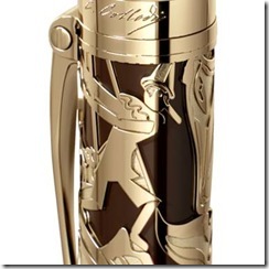
Despite all of these hidden treasures, the truly magnificent aspect of this pen, surprisingly enough, is the cap. Collodi’s fairytale world is unfolded in a magnificent, gold-plated skeletonized design that depicts the story’s heroes and villains in a mesmerizing light. Pinocchio, Jiminy Cricket, the fox, the cat, and the whale are all illustrated in an elaborate design that looks invitingly playful and yet majestically noble at the same time. Their light-colored forms against a dark brown background bring to mind a puppet theatre, and it is clear that Montblanc’s designers have put on a show worth seeing.
clip_image010
The gold-plated clip is connected to the cap by a screw, symbolizing the joints of everyone’s favorite marionette. Above the theatre-show is a golden bar with Carolo Collodi’s signature right under Montblanc’s traditional, striking logo.
Carlo-Collidi-Pen-(6)-Ballpoint
Though its body is an architectural masterpiece, the heart and blood of the Pinocchio pen actually lies in its customized ink. Montblanc presents the treasure in a 50ml bottle with a deceptively unadorned look. The outside only boasts Collodi’s signature with a small drawing of Pinnochio’s head on the opposite side. Once opened, however, the true value and ingenuity of the ink is immediately apparent. Styled to emulate a warm chestnut color, this ink has the personality and texture to leave you captivated every time you use it.
Ever since I was a child I’ve been witness to Ariel finding true love, Jack’s apparent inattentiveness, Little Red’s ignorance, and Alice finding her way home, but Pinocchio has always stood out as something more. It is something more than an overdramatized ethics lesson. It was a fantastically crafted allegory of contemporary society, values, respectability, optimism, and, of course, honesty. Montblanc’s interpretation of the legend is akin to the story itself: unique in its own right. Most tributary pen designs are clear-cut and hone in on one particular aspect of its subject, but Montblanc takes in all of Pinocchio’s traits. Like the story, this latest addition to an already marvelous collection is a compilation of designs, ideas, themes and, most importantly, beauty.
Carlo-Collidi-Pen-(2)
Writers young and old will be reminded of these meanings and values from the first moment they begin their lifelong journey with these pens.
Also,if your kids don’t know Pinochhio ,probably its time you include his story in the bedtime.
image


Read more »

© 2016-2018 Pen Boutique.com. All rights reserved Privacy Policy Terms of Use