Closer look at Sailor’s Ink Studio line:
History & Background:

If you have been reading my blogs it comes as no surprise that Sailor makes some of my favorite inks and a lot of them come from this line of their inks. If you aren’t familiar with Sailor, they are the oldest fountain pen manufacturer in Japan and have risen to a global acclaim during this time. As far as their ink studio goes the collection is comprised of 100 inks that are based upon the custom blends that the ink meister Ishimaru mixes for people at pen shows. The numbers don’t seem to be random however Sailor themselves haven’t said anything about the pattern of the numbering system so I believe it is to denote how the ink is mixed and how much of different components go into a single ink. Obviously I can’t take a look at every single ink studio ink however I will be going over the ones found in my own personal collection, those being inks #531, #973, #252, and #280. Without further ado lets take a look at how these inks behave on Tomoe River paper!
Ink #252:

This is one of the newest releases from the ink studio line and it was actually one of three that replaced three other inks that Sailor decided to retire for some reason and coincidentally I'll be going over one of those retired ones a little later. This one is very interesting and is actually marketed as behaving differently depending on the paper its used on, I mainly use Tomoe River 52g and it looks pretty purple-gray. The ink does this weird thing that I’ve noticed with sailor and that’s that it gets these sort of pockets of different colors, different from shading. Shading makes it sound like a gradient which is not what this effect looks like so keep in mind that it is going to look a little different.

Ink #280:

This is another ink in the set of three that 252 was apart of so it's one of the newest inks and I really didn't know if I'd like this because I didn't have any inks remotely like this color previously but I gotta say, I was not disappointed. It almost reminds me of a muted watermelon color because the base color is a soft tan but has some really interesting green and light pink shading in the lighter spots. This is just an example of how Sailor really elevates colors because when looking at this bottle I don't think I'd buy it just because the color isn't really my thing but when you see the swabs and how it changes on paper and heavy application it really changes and becomes a completely different ink.
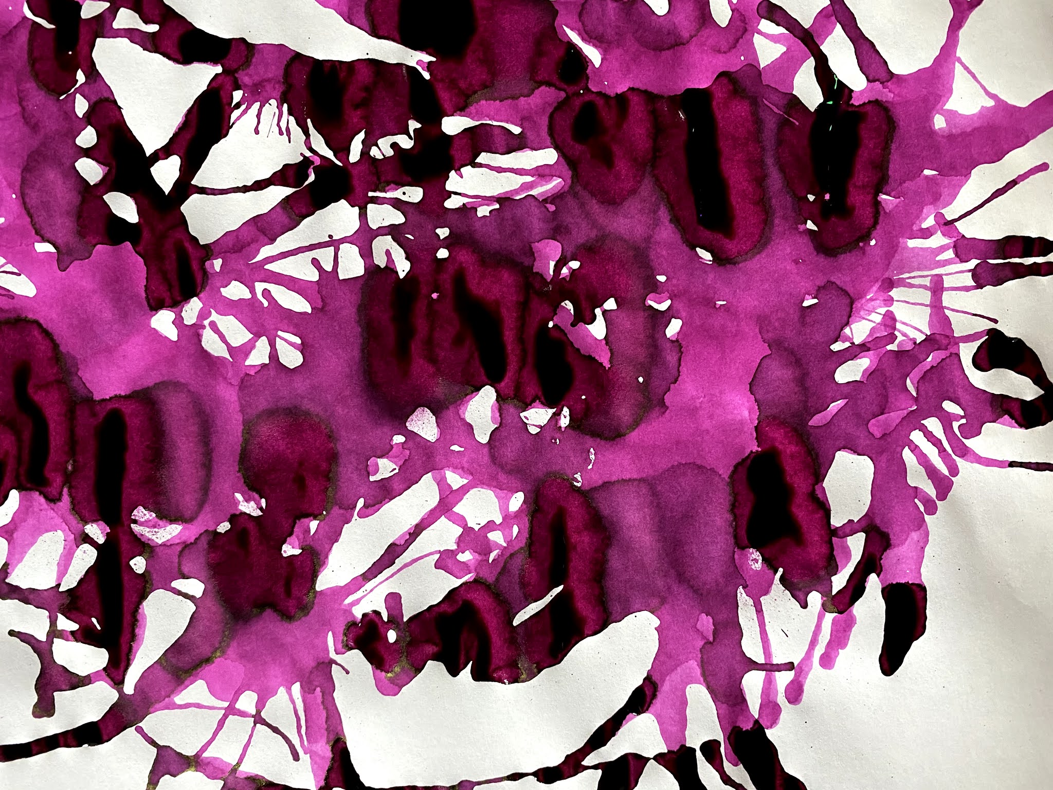
Ink #531:

This is one of the inks from the line that has been retired recently which means that some places may still have the inks available however they won't be produced any longer so what's out there is it for the foreseeable future. Im not really sure why they picked this ink to go, I know that they want to have 100 inks in the line so I suppose they had to get rid of 3 if they wanted to add 3 but I have no idea how they picked the inks to retire. The ink itself is a very vibrant pink that has some darker shading but really not much color variance like the other two on the list, the bottle I used for the splatter is actually my mother's and she really enjoys this ink, both of us are sad to see it go. Not much in the way of sheen but like I said, just take a look at this shading...
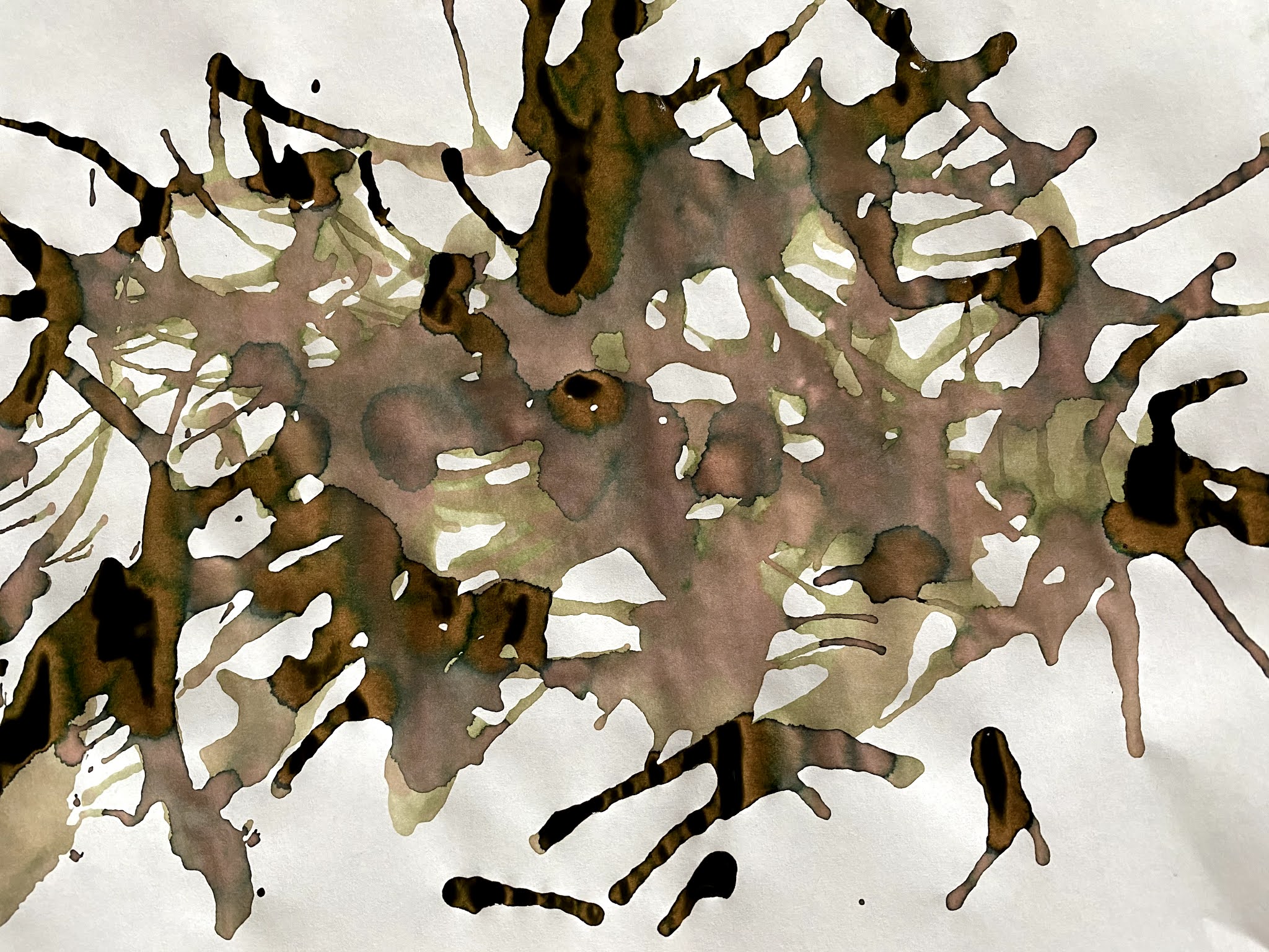
Ink #973:
Okay, last but not least we actually have my favorite ink from the studio line and that is #973, I find that my pen choice really gravitates towards gold trim and more brown or earth hue pens so I needed something really interesting to put in them that would not only match the pens but also be fun to look at when it was done drying and spoiler alert, I found all of that in this ink. The ink itself has some very subtle dark sheen but the shading is really what pops with this ink. I like it in any nib size because it can look either orange or brown and is a perfect fall color. It also, so far, has not crusted up at all like some of my other orange inks and is very well behaved despite the problems orange inks are usually plagued with. This is in two of my pens currently and I make sure I have at least one pen inked with it at all times that's how much I like this ink. Oh, and I forgot to mention this was the ink that first got me into the Ink Studio line.


