Showing posts with label ink review. Show all posts

Monday, May 11, 2015

Spring with MontBlanc’s Pink Ink


Celebrate spring with Mont Blanc’s Pink Ink. It is the perfect ink to spruce up any diary or journal and get your doodling juices flowing.

The bright pink box that the ink comes in is a departure from Mont Blanc’s typically understated packaging, but that is part of the fun with this ink.

Mont Blanc Pink is probably not going to be an everyday carry for most folks, but if you like pink you will like this shade. It is a fun ink to doodle with as it shades well and dries fairly quickly. I inked up my Hot Pink Safari so I could test different nib sizes. The larger the nib, the darker the ink appears.


I also compared it to another popular pink ink, Iroshizuku  Kosumosu (Pink). The Mont Blanc Pink is a tad brighter and a slightly deeper shade of pink than the Kosumosu.


Pen used for the Mont Blanc Pink Ink is a Pilot Prera Pink, with a Calligraphy (CM) nib. Pen used for Iroshizuku Kusomosu is a Pilot demonstrator with a Calligraphy (CM) nib.

-Linda, Pen Boutique Ltd, Columbia Store.


Read more »

Tuesday, November 4, 2014

Noodler’s Pens and Ink - May be this is all you need.

 
Many of you have probably already heard of Noodler’s; whether it was the inks that attracted you, their new line of pens or their occasionally, infamous reputation; this company has been a constant presence in every pen enthusiast’s mind. The rest of you, however, have no idea who they are, so prepare to be amazed! The Noodler’s company is named after a sport played down South in the United States known as “noodling.” Those of you with southern roots know what I’m talking about, but if you are a cultural turtle on southern traditions, allow me to enlighten you.

 
Noodling is a sport where the objective is to capture a live catfish. (Which is, as expected, Noodler’s logo.) What makes this sport different from fishing, you ask? Well, when noodling, you have to use your bare hands! Noodling enthusiasts feel this gives the catfish a fighting chance. This idea is what The Noodler’s Company is all about: giving you a chance to get a quality product at a fair price.
If there was ever a controversial company in the world of luxury stationary, Noodler’s Ink would be that company. From its genesis, the American-born company had a lot of competition from its oversea cousins Namiki, Faber-Castell and Lamy and even its homegrown siblings Cross and Waterman. All of these companies have a steady fan base, and their own individually cultivated reputation and image.
Noodlers-All
Those who have experienced Noodler’s Ink’s…ink, however, have always been in conflict about whether they actually like it or not. The company has a tendency to be inconsistent in the quality of its pens and this unreliability has turned many enthusiasts away from the brand. Now, before you get out your torches, let us evaluate Noodler’s Ink fairly.
While the Pen Boutique has carried Noodler’s Ink’s ink, carrying their pens always seemed like it would bring about a Schrödinger’s Cat scenario (And frankly, whether the cat – or pen, in this case – is “alive” or “dead,” it will always be a stressful situation for everyone involved). For a long time Pen Boutique never carried Noodler’s Ink’s pens, and it ultimately seemed like a good idea. However, ever thoughtful of our public, it was decided that going out of our way to listen to the requests of the more than 40% of customers who genuinely like Noodler’s Ink’s pens, regardless of their indiscriminate effectiveness. Though they are a minority, Pen Boutique listens to each and every request sent our way. Even if uttered by a single voice, we pay attention to our customers and try to give them the best experience imaginable.
The Noodler’s company has a past decorated with extravagant inks of different shades and qualities. The list of products is so extensive that a classification system had to be developed. The “Freeze Resistant” class resists freezing temperatures far below zero; the “Eternal” class resists the hardships time such as moisture humidity and UV light; the “Bullet Proof” class is capable of resisting all known tools of forgery such as, carpet or oven cleaner, bleach, UV light wands, solvents, petrochemicals, and even water!
Interestingly enough, these classes are not set in stone. Inks can be grouped in multiple classes, such as being Freeze Resistant and Bullet Proof. (Very useful if you ever become a top secret agent and have to fight Russian spies. Or if you’re just a careful person and live somewhere cold, but the former reason is much more exciting.) All of the inks are made from a special cellulose reactive substance developed in Rochester, New York. They are all also, for the most part, waterproof, so their properties remain even when dried. The ink can be reconstituted with simple tap water! How’s that for convenient?
That’s enough about Noodler’s already well-known inks. Let’s move on to their pens. Their newest line includes treasures such as the Piston Fill Resin fountain pen, the Noodlers Ebonite fountain pen, and their roller ball counterparts. The Piston Fill Resin has an extremely classical and traditional look. It possesses a bow windowed ink chamber design that is similar to pens of the 1960’s. The piston seal is made of a unique type of nylon, which is the same material used in high-end piston fill pens. The Noodler’s Piston Filled Resin fountain pen is made from a celluloid derivative, like the inks, and boasts a variety of colors including: black, red, orange, turquoise, burgundy, and navy blue.
The Ebonite is slightly different: it has a metal cap clutch with an internal seat to prevent the more forceful writers from destroying the cap. This is a blessing for those of us who post our caps for balance, or otherwise. It also has an ebonite double fissure wide channel feed (and this is where the ebonite comes in). The pens both have a stainless steel “flexible” nib, which basically means that depending on the pressure you put on the pen, you can get a medium font, or a broad font! (Awesome, right? I was so excited when I heard about this.)
Nib-Compare
The two fountain pens also possess a rim band that protects the ebonite from the damages of long term use. The Noodler’s brand Roller Ball pen is made with an ebonite feed system, much like the other two fountain pens. The design was inspired by an 1870 style with a fine ball tip. These pens and inks are cost effective, water proof, and revivable if dried. However, the inks cannot be mixed with other, more “conventional” inks. This will cause the special properties in the Noodler’s ink to become inactive, but with the things these inks do, who needs another kind of ink? The Noodler’s ink should not only be kept away from other inks, but you should also be wary of which types of pens you put the ink in as well. There have been a few instances where the pen was bleeding through, and a few cases of nib creep. To these problems, my advice is to clean out your pen, if you have not done so already, or try the ink in another pen. If that doesn’t work then you should definitely call in and talk to Noodler’s customer service division.
These pens and inks are mostly made for your hard core writer. If you take notes at school for hours on end, the Ebonite fountain pen is the one for you. Its durability allows you to write for ages without it suffering any damage. Also, don’t forget to use a Bullet Proof-Eternal ink so that you can have the notes for a long period of time without it smudging or being washed away by liquids. (Cause I know we’ve all had that happen to us at some point.)
As a fun side note, I would like to point out the delightful names of the inks. “Habanero” is a deep sauce red named after the famous pepper used in southern dishes. “Polar Blue/Black” are named for their tolerance to extremely cold temperatures. Each of the Noodler’s Ink’s inks have their own unique name that adds a refreshing touch of flavor and individuality.
The Noodler’s ink appears to pride itself on the life span of their pens and inks. This sense of pride is not misplaced, even though there may be a few hiccups. There is nothing perfect in this world, and with that in mind I’d say that for the most part these pens and inks are pretty fantastic. If you can get past the minor issues, which every pen goes through, no matter how high-end, then you will not regret it, and your enjoyment of the product will last as long as the ink does.


Read more »

Wednesday, October 15, 2014

Pilot Namiki Iroshizuku Fountain Pen Bottle Ink

So much ink and so little time .Not fair.
Seventeen colors from a single manufacturer, that’s a lot of ink . I wish I could use every color with my Namiki Vanishing Point Fountain Pen (Broad Point). Slowly, I will fulfill that wish but right now I tried a few colors that looked very appealing to me.
So I started my quest of filling the so called Pilot Namiki Iroshizuku Ink Bottle to know what the buzz is all about.. First I filled the pen with tsukushi(Field HorseTail) . This is a Reddish Dark Brown colored ink . Namiki Vanishing point Fountain Pen comes with converter . Now the best part about a converter with a nib is that we can have different converter filled with different colored ink and that helps to avoid cleaning the nib when you want to change the color of ink. Hats off to Pilot Namiki to bring in this technology which helps fountain pen lovers to try different color without having to undergo the pain of cleaning the nibs. I started to write in my to-do lists of Filofax Finchley Filled Organizer Pocket Size Black
clip_image002
The drying time of the ink is little high when compared to other inks. But again that depends also on the paper used. On the filofax organizer paper ,it took around 3-4 seconds to dry and on an ordinary white paper,it took lesser time to dry.
These luxurious line of ink from Pilot Namiki were created to reflect the beautiful natural scenary of Japan ,different local flowers and fruit. The bottle is truly gorgeous and will fill your fountain pen with different colors for different season.Try Winter with Old Man Winter (fuyu-syogun) ,summer with Deep Cerulean Blue or Sunset (yu-yake) and Fall with Autumn Shower (kiri-same) or Autumn Leaves (momiji)
1) Tsuki-yo Night Sky (Greenish Deep Blue) would compare it to the Blue-Black Color . It contains more Green to be called a genuine blue-black.It has a moon-ish color . (“tsuki” means moon ).
2) Tsukushi Field Horsetail - This is the ink that matches the color of my Namiki Vanishing Point Fountain Pen.It is nice chocolate based brown and there is bit of reddishness in the color.Its based on a grass named horsetail which is basically green in color .But the color which Pilot thought about when making the ink was dried horsetail.( I don’t know…iam just guessing it wild(weed?))
3) Asa-gao Morning Glory (Vivid Purplish Blue) . The first color that came in my mind when I saw it was the the J. Herbin's Eclat de Saphir. I put 3 drops on a J Herbin Blotting Paper
clip_image004
One observation of the ink is that it is not as viscous as J Herbin ink.
The color is based on the flower Morning Glory found in Japan . This flower was introduced to the Japanese in the 9th century, and they were first to cultivate it as an ornament
clip_image006
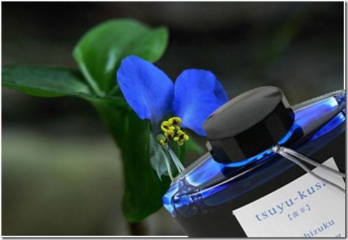
4) Tsuyu-kusa Asiatic Dayflower
Based on the flower shown below .It is considered to be in the weed family but is also consumed as leaf vegetable in Japan and other countries in Southeast Asia.
clip_image008
5) Ajisai Hydrangea – this shade of blue is reminiscent of the image of raindrops nestling on its petals.
clip_image010
The color of this ink is based on the flower Hydrangea which blooms during early spring to late autumn .There are many varieties of this flower with different colors.Out of that the following varieties are found in Japan Hydrangea hirta, Hydrangea involucrata, Hydrangea macrophylla and Hydrangea serrata. Hydrangea is a common flower in China than Japan.
6) Kon-peki - Deep Cerulean Blue - expresses the color of a vast and clear summer sky.
clip_image012
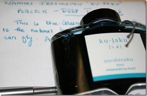
7) ku-jaku Peacock – a green color which evokes visions of the stark and vivid feathers of the richly multicolored peacock.
clip_image014clip_image016
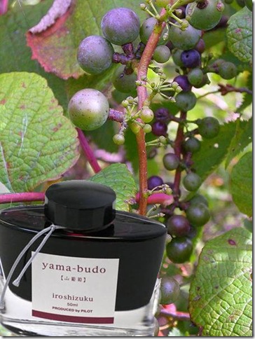
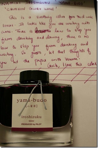
8) Yama Budo Crimson Glory Vine – this red embodies the bright and ripe fruit of the wild, yet subdued crimson glory vine. I wish they made wine with this vine. The fruit resemble red grapes..but it is not red grape.The color is an exact match to red wine.
clip_image018clip_image020
9) Tsutsuji - Azalea – a red hue like the common red amongst the myriad hues of the Azalea flowers.
Are you a Sagittarian? This ink may bring you luck. The color of the ink is based on the flower Azalea which is the flower for astrology symbol Sagittarius.
Amazing snap of Azalea in mountainous region of Japan.
clip_image022
clip_image024
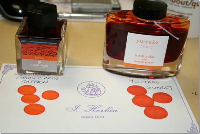
10) Yu-yake Sunset – an orange hue like sky, painted by the evening sunset on clear day.
There are no more apt words to describe sunset than the poem by Victor Hugo
Synopsis of the poem
I love the evenings, passionless and fair, I love the evens,
Whether old manor-fronts their ray with golden fulgence leavens,
In numerous leafage bosomed close;
Whether the mist in reefs of fire extend its reaches sheer,
Or a hundred sunbeams splinter in an azure atmosphere
On cloudy archipelagos…………..

All vanishes! The Sun, from topmost heaven precipitated,
Like a globe of iron which is tossed back fiery red
Into the furnace stirred to fume,
Shocking the cloudy surges, plashed from its impetuous ire,
Even to the zenith spattereth in a flecking scud of fire
The vaporous and inflamèd spaume.


Caran D Ache “Colors of the Earth” Ink Bottle with Saffron color is very much similar to the color of Yu-yake.If you are a color freak,this one should find a place in the collection .
clip_image026


This is the second color that iam testing on Blotting Paper . If you look closely into the ink of Pilot,it looks like it is more watery than other inks. This may be the reason why Pilot Namiki’s ink is more smoother while writing.
11) yama-guri Wild Chestnut – a brown color similar to the image of a ripe, fallen chestnut shell during the longing season of autumn.
clip_image028
12) fuyu-gaki Winter Persimmon –The color of this ink is based on an orange similar to the shade of a lusciously ripe persimmon.
clip_image030
Now there is an interesting fact about Winter Persimmon. According to folklore (which means it hasn't been scientific proven, or disproved), the severity of approaching winter can be cutting open a persimmon seed and looking at the shape of the kernel inside. Hold the seed carefully with a pair of needled-nose pliers and use a paring knife to slice it open.
If the kernel is spoon-shaped, lots of heavy, wet snow is forecasted.
If the kernel is fork-shaped, powdery light snow and a mild winter is predicted.
If the kernel is knife-shaped, bitter icy cutting winds for next few months will occur.
It is recommended to cut at least ten seeds to determine the outcome of the kernel shape.
Iam glad that Pilot had one color which is based on Edible fruit.
clip_image032
13) syo-ro Dew on Pine – a green shade similar to a dewdrop reflecting pine needles.
14) shin-ryoku Forest Green – embodies the unchanging color of a dense evergreen forest in a long winter.
15) kiri-same Autumn Shower – a grey shade like a landscape expectant of winter.
16) fuyu-syogun -Old Man Winter – a grey conjuring up the image of the cold, clear air of the severe winter season.
17) Shin-ryoku –Deep Green – The inks are based on the flower and the natural beauty of Japan. So this ink
The bottle is cleverly done. It’s pretty tall and narrow .It holds 50ml of ink. The opening of the bottle is also quite wide for bigger pens to be dipped or filled. There is an triangle shaped depression in the bottom of the bottle (as shown in image below) which allows us to enjoy the last drop of ink(afterall we need to get that last drop as the ink is not cheap)
clip_image034
Colors are saturated and lubricated
In short this can be rated as one of the most beautiful ink ever produced (I know lots of MontBlanc ,Aurora or J Herbin ink lovers would be raising their eyebrow on this comment, at least the bottle deserves credit..come on) .The ink costs $35 a piece but we give a 20% discount and sell it for $28. Just for today/tomorrow ie October 15th 2010,for the agony of reaching until here reading my blog,I am giving additional $3 off using coupon code JAPAN3 at checkout.
Well..that’s a lot of writing and in the end , like the ink or not..I think I started liking Japanese..:)
Read more »

Saturday, September 27, 2014

Pelikan Edelstein Fountain Pen Ink Bottle

Seven vibrant colors from Pelikan named Edelstein is now in stock here at Pen Boutique stores/warehouse to be shipped out and tried by the pen/ink lovers all around the world. The word about this ink bottles is out since mid of 2009 and stocks are depleting fast enough as there was many preorders for this ink bottle.


At the first glance it looked like we are getting about 30ml of ink in the bottle,but wait the bottle says 50ml. It looks like the ink is stuck on the ceiling of the ink bottle .The glass is an absolute beauty and the base of the glass is spread across giving it the extra curve to hold more ink.The bottle is called ‘flacon’ .Bottle is pretty heavy and the ink along with bottle weighs 9.6 ounces.The ink is Made in Germany and Pelikan calls it the Extra Soft Ink.


Now an ink like this is definitely worth trying. So I filled my Pelikan M215 Fountain Pen with one of the colors ,every color looked good,so I selected a random color JADE(sounded like a pretty nice name). The writing was pretty smooth and I felt that ink was drying at a pretty decent pace.The color of the ink was elegant soft green and the ink never skipped while writing. Need to try another color (guessing Mandarin as its close to the Rhodia note pad that I use everyday as my mouse pad)


It is definitely worth to have each color in your collection. Each bottle costs 20 dollar and there are 7 colors with a gemstone theme: Ruby, Mandarin, Aventurin, Jade, Topaz, Sapphire, and Onyx.Edelstein is the German word for ‘gemstone’ . The Edelstein collection has stirred a lot of interest among the pen lovers as it has been quite sometime that an company has released fancy ink bottle.Well,guess the wait is worth it.But only time will tell whether it has been accepted by ink lovers across the globe.Waiting for comments from users.
Read more »

Saturday, August 23, 2014

Montblanc Honore de Balzac Writer Series Ink - Dandy Turquoise

 Montblanc Honore de Balzac Writer Series Ink - Turquoise

- Leena Menon

Every year Montblanc releases the famous Writer Series Limited Edition Pens.  For past 3 years they have been releasing the famous Writer Series Ink Bottles in limited quantities to match with these writers series  edition.  All of the writer series inks have shown some wonderful colors and have been an instant hit with the customers.  The Carlo Collodi Brown ink bottle, Jonathan Swift Sea Weed Ink bottle has been an instantaneous hits with customers.  Customers still ask for the Carlo Collodi Brown ink but alas they are sold out and in fact one customer bought 24 of them to keep them in stock.

So what makes Montblanc  Writer Series Limited Edition ink so special?  Well for one they are a perfect match to the Limited edition series.  I would say it should be included with the purchase of the respective Montblanc  Writer Series limited edition pens and that is exactly what we do it also ( as long as it is in stock since the ink fanatics ( me! me!) can really empty those shelves in no time).  Another reason is the lubrication of these inks are fantastic.  They are a perfect companion for your Montblanc fountain pens and in fact any of the fountain pens. They do flow easily, so those with heavy flowing nibs have to be aware.  Their drying time is  pretty good ( please see the image with smearing done in 1 seconds, 5 Seconds). But I think the best reason that they are so famous is that the ink colors so far has been outstanding and have special meaning towards the author.

This year's writer series limited edition - 2013 is in the honor of Honoré de Balzac.   It is an interesting choice by Montblanc as some of the work by this author has been banned from some countries.  But I guess above all it is the author and the hard work that writers put forth which needs to be accounted.


The ink for the Limited Edition 2013 is nicely called Dandy Turquoise ink ( it was initially marketed as Sandy Turquoise ink, but then in the end it was decided to be Dandy.  So it is all sandy-dandy!).  The turquoise is a beautiful shade and if you remember the discontinued Montblanc Turquoise ink, it is a little shade darker than that.  There is no or little feathering of the ink.


I have given a sample writing with the ink on my favorite Rhodia Meeting book on 80g Clairfontaine paper.  Rhodia papers are usually very ink resistant and does take little bit of extra time to dry. The plus side is that you can use both sides of the paper with a fountain pen with some smooth writing.  The pen used for testing is Pelikan M200 with Italic Nib.


.

The repeated swab tests shows that the ink has a nice turquoise color to it.  I have also tried the dip pen test where I have kept the dip pen for 4 min to get a darker turquoise color ( I love this color! Need to ask Noodlers to create some for us )

The ink is beautiful and the picture does not do full justification especially if you love turquoise color.  The bottle is a nice thick bottle just like the Jonathan Seaweed Ink bottle.

Get  this collectible  bottle of ink today while it lasts.  Believe me they are worth it. 

Read more »

Tuesday, August 5, 2014

Montblanc Ink of Joy,Ink of Friendship and Ink of love


After blogging about the Montblanc – A tribute to the Mont blanc pens,I was hesitant to blog about Montblanc again as there are new products coming soon like the Namiki Vanishing Point 2011 Pink Special Edition, Cross Year of the Dragon Pens and many others. But these new bottles of ink sitting on my desk staring at me everyday persuaded me to blog about them..Probably ,it’s the joy that I gain by trying out with new inks that made me to start writing about them… its probably the love for ink that compelled me to pick my pen and dip it in these new vibrant colors and its probably the friendship that I have with my readers ,that I wanted to share my feeling about these new ink bottles .


MontBlanc-INk-Cartride-and-Bottles

(Looks like not even 2 eyes,but 3 of them staring at me)
The Montblanc Ink of Love, Joy and Friendship 30ml Ink Bottles Refill. Montblanc has this compelling habit of taking old products, sometimes less than a year old, and upgrading them. Whether it’s adding scent, changing bottle styles, or revamping original designs, Montblanc obsesses over making every one of their products the best they can possibly be. This year, Montblanc has redesigned three specific inks with their own unique brand, name and bottle. Don’t you think Old Wine in new bottle tastes a little better Smile
To begin, the Ink of Love is a modernized version of Montblanc’s original Red Ruby released in the late 1990’s. Though beautiful, this shade was more reminiscent of the pale orange-pink color that many pen companies such as Lamy and Pelikan had recently created than the deep red it was meant to personify. In 2008 it was changed to a magenta-red color and given a rose scent. The ink was renamed Love You and in three years it was given another facelift. The Ink of Love is a much darker medium red with more brownish tones compared to its predecessors. Although darker, the intensity and mystery of the ink draws you in and captivates you from start to finish.

Montblanc always compliment their ink bottles by creating the same variety of cartridge for the easy goers.Montblanc ink of love,ink of joy and ink of friendship cartridge comes with 8 cartridge and will last probably a week for deep writers like me..Iam always a bottle fan..

ink-of-love
Next, is the Ink of Joy. Its ancestor is the Mahatma Gandhi Saffron released in 2009. This original was packaged in Montblanc’s traditional rectangle shoe-styled bottles instead of their recent square ones that possess a beautiful ripple effect. The Mahatma Gandhi Saffron was a very rich orange with little to no yellow or brown tones, and gave off a cream and carrot color. The Ink of Joy, however, is a much more vibrant and intense orange color that manages to be eye-catching without being garish. It has a smooth, beautiful hue that evokes thoughts of sunsets, autumn leaves, and jack-o-lanterns.
ink-of-joy-bottleink-of-joy
Last but certainly not least, the Ink of Friendship. Its origins lie in the Montblanc Turquoise that was released in the late 1990’s. It was a dark teal and aqua color that had hints of green. It was so smooth, crisp, and fun to write with it was not to be believed. Montblanc has kept the ink’s mechanics but changed the aesthetics. The Ink of Friendship is a medium cyan blue that is much brighter, more intense, and is strictly turquoise with no green tones to speak of. This new ink is bright, beautiful and gives a flawless, effortless performance that speaks for itself.
Friendshipcart-of-frienship
Each ink comes in Montblanc’s newly-styled bottles that are a stark contrast to their more traditional ones. All the bottles are labeled “Made in Austria” with the ink’s name in French underneath.
Montblanc has also confirmed to us that author being honored in the Writer's Edition collection this year is Carlo Collodi who is best known for having written PINOCCHIO.Here is the first glance of the eagerly awaited pen.Watch for our blog on it…
image
In the meantime,find all the spices of life viz Love,Friendship and Joy at Pen Boutique in a 30ml bottle or 8 piece cartridge .I wish life was that easy.


Read more »

© 2016-2018 Pen Boutique.com. All rights reserved Privacy Policy Terms of Use